Four Winning Cushion Color Combinations
We’ve put together four fail-proof combinations to help you nail styling your couch or bed. Spoiler: it’s all in the golden Rule of Three
Read more
Four Winning Cushion Color Combinations
We’ve put together four fail-proof combos to help you nail styling your couch or bed. Spoiler: it’s all in the golden Rule of Three
By: Charlotte Olby
When considering what cushions go with… well, what cushions, it all comes down to a simple Rule of Three: identifying a color scheme, mixing pattern, type and scale and adding dimension with texture. While color can be easily added into your home with the addition of a few well-placed accessories, artwork or even reaching for the paintbrush, the easiest and most versatile way is with a selection of beautiful cushions. From the centerpiece of your living space (the couch) to the centerpiece of your relaxation (the bed); styling with cushions and throws adds softness, personality and comfort to anywhere they might lie.
Despite being lovingly labeled ‘throw’ cushions, it does actually take a little more know-how than to simply throw-on-and-go to nail a winning combination of cushions. If you don’t have the time or inclination to scroll through endless moodboards of inspiration, we’ve put together four winning cushion color combinations to help you nail the process while following the golden Rule of Three.
Introducing: Cushion Mathematics.
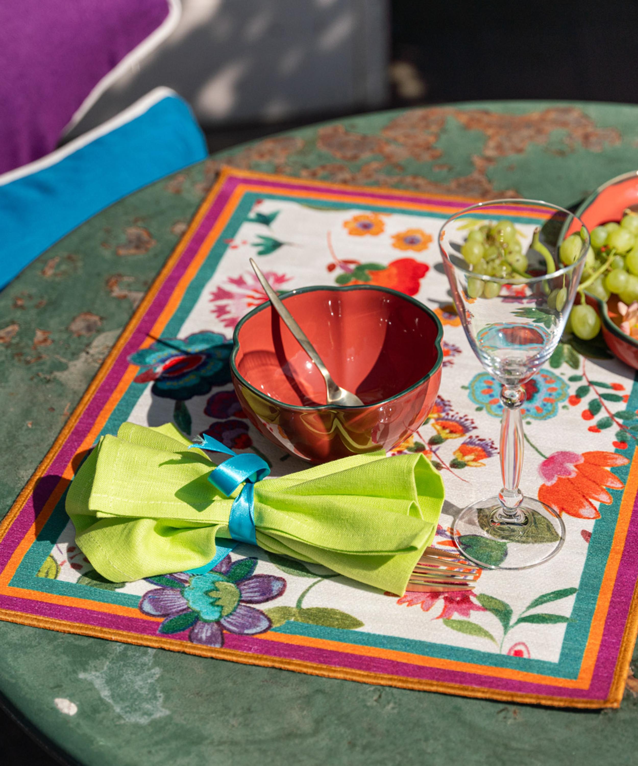
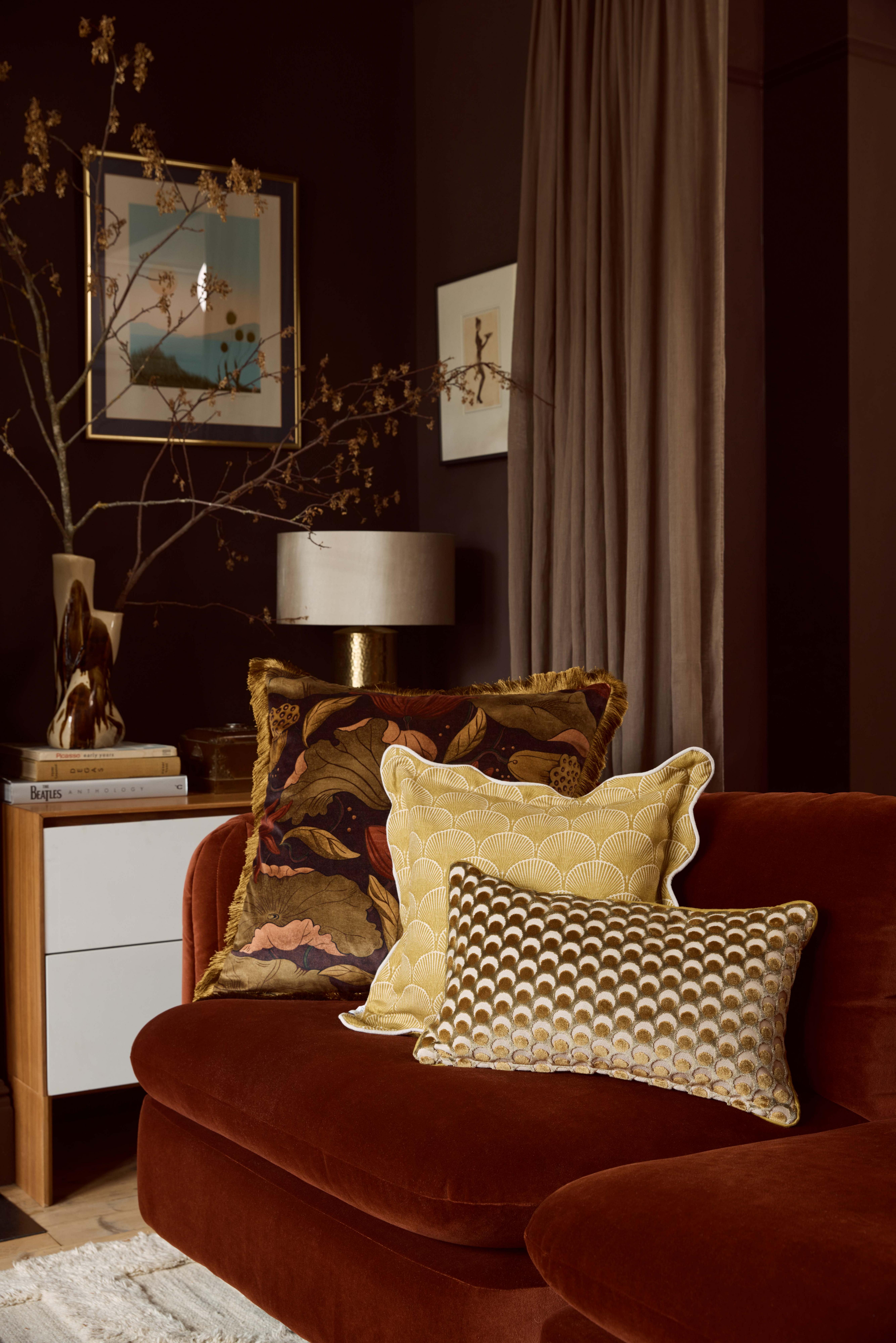
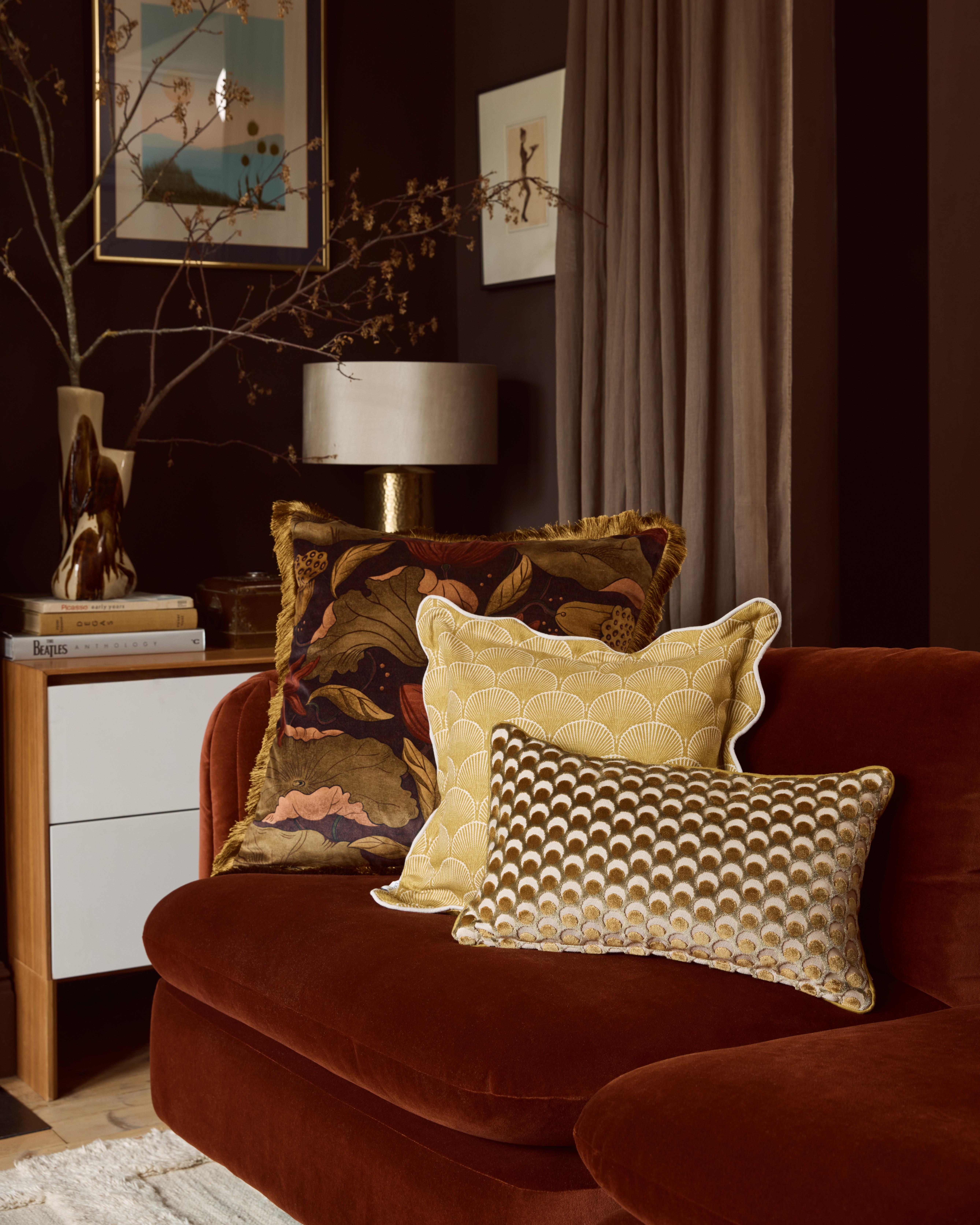
Green + Mustard
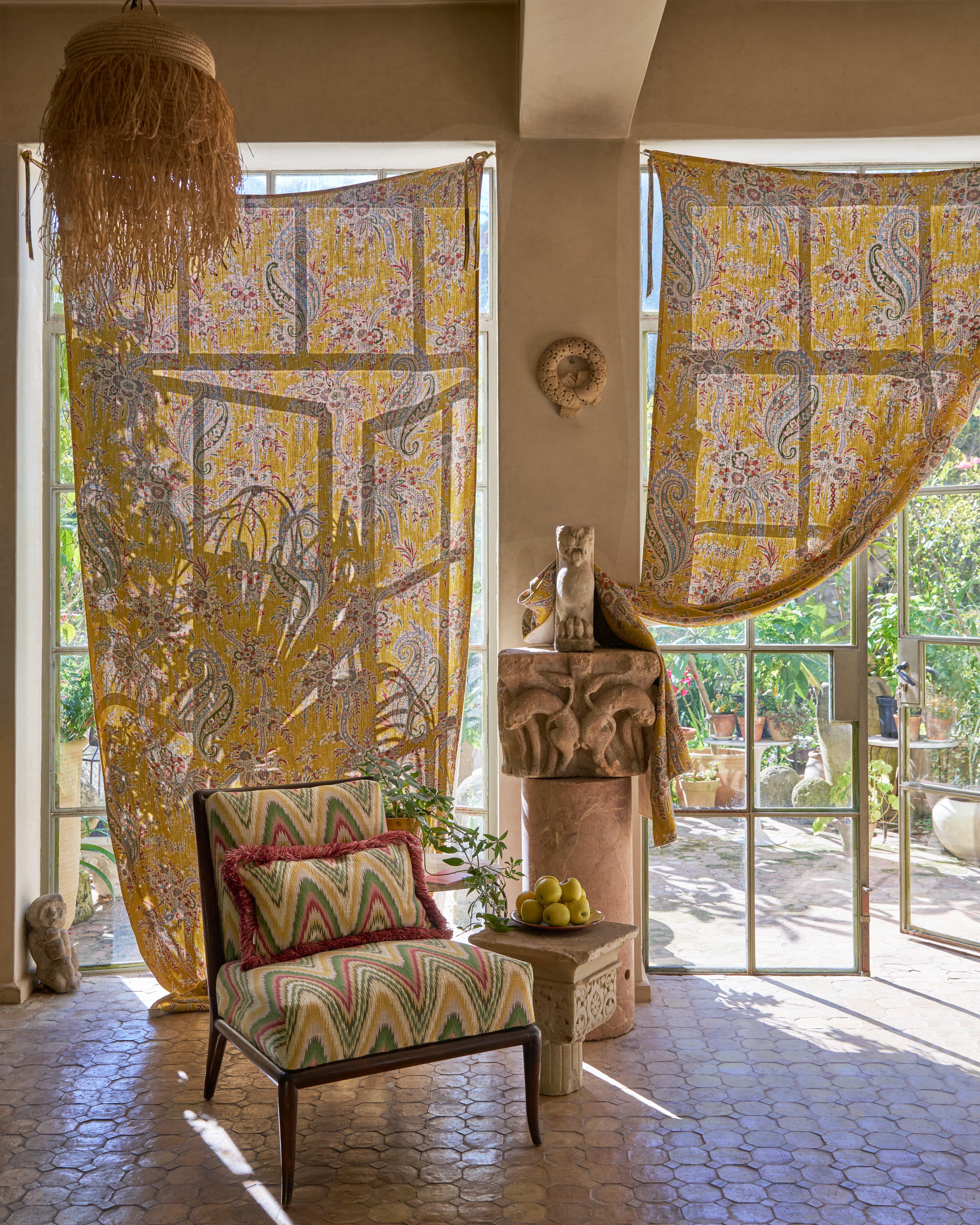
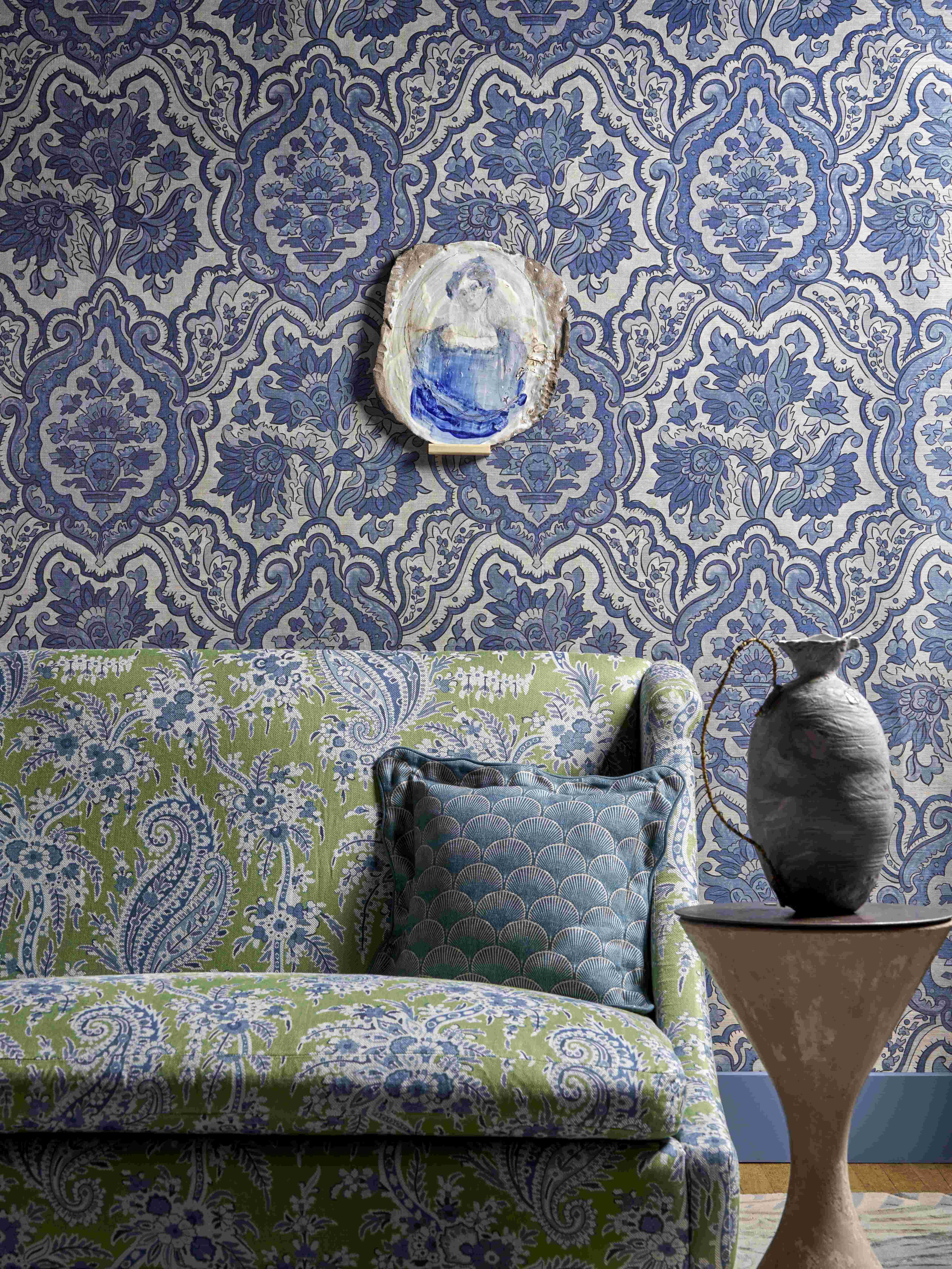
A simple method to help you develop a color palette is to pick varying shades of the same color, such as pistachio green with emerald green, and add in a pop of color with a contrasting second shade. By opting for a deep velvet in this warm mustard you stick to the same family of earthy, natural colous for a curated couchscape.
Red + Pink
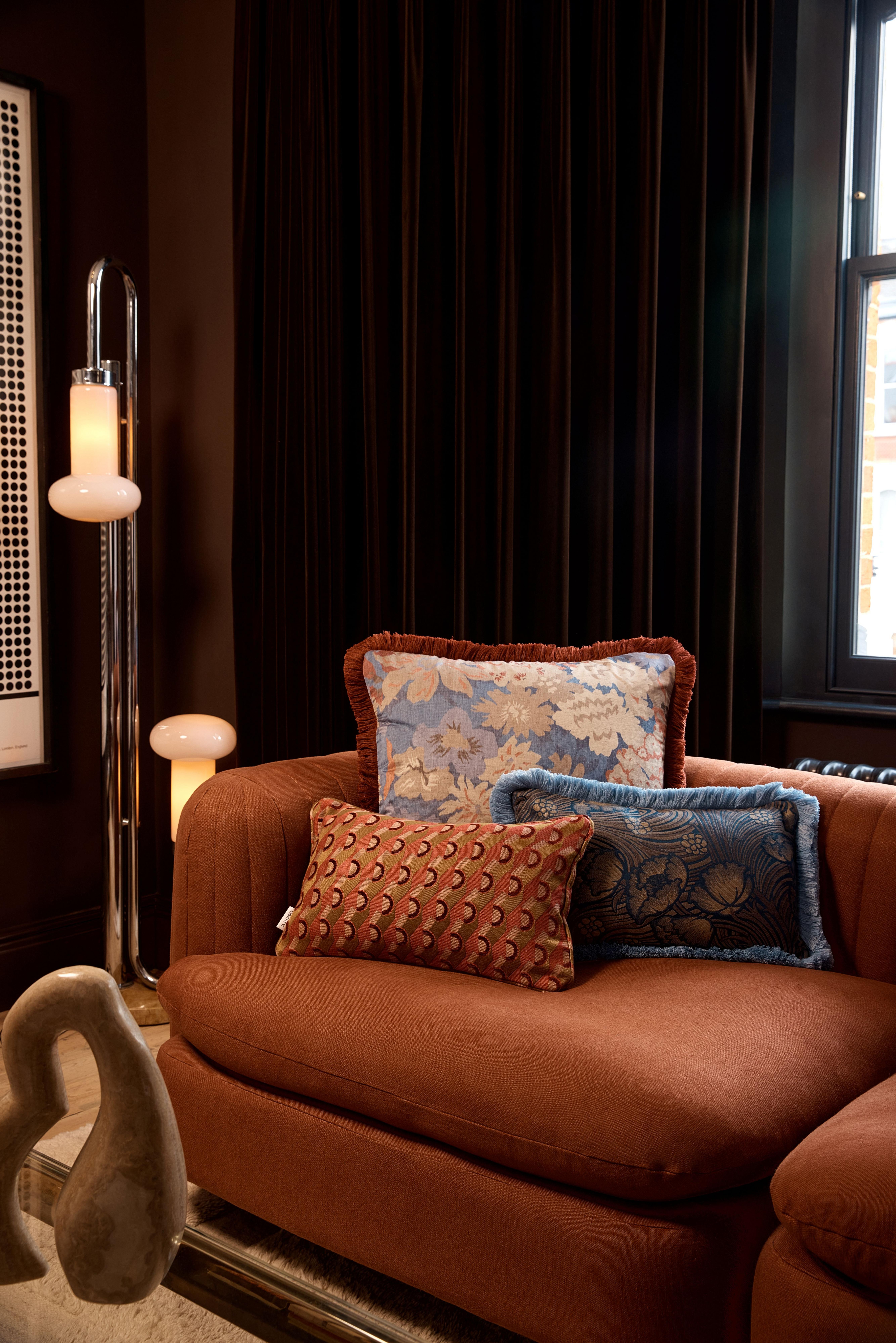
Often considered clashing colors, red and pink are actually analogous colors meaning they sit together in harmony on the color wheel. By bringing the most beautifully detailed design to the front with bigger, more comfortable cushions behind, you will anchor the color scheme and allow the smallest cushion to truly shine.
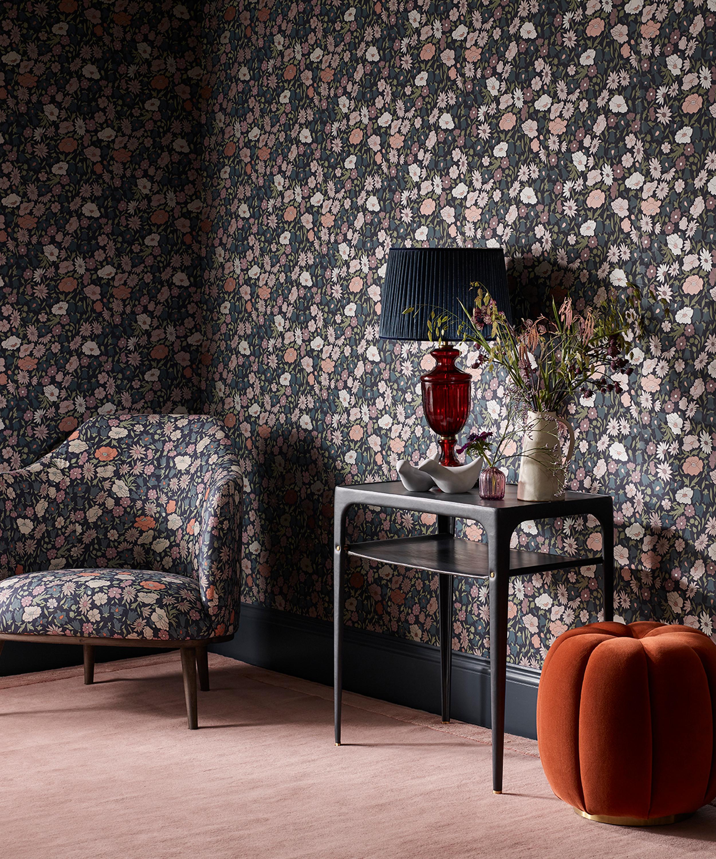
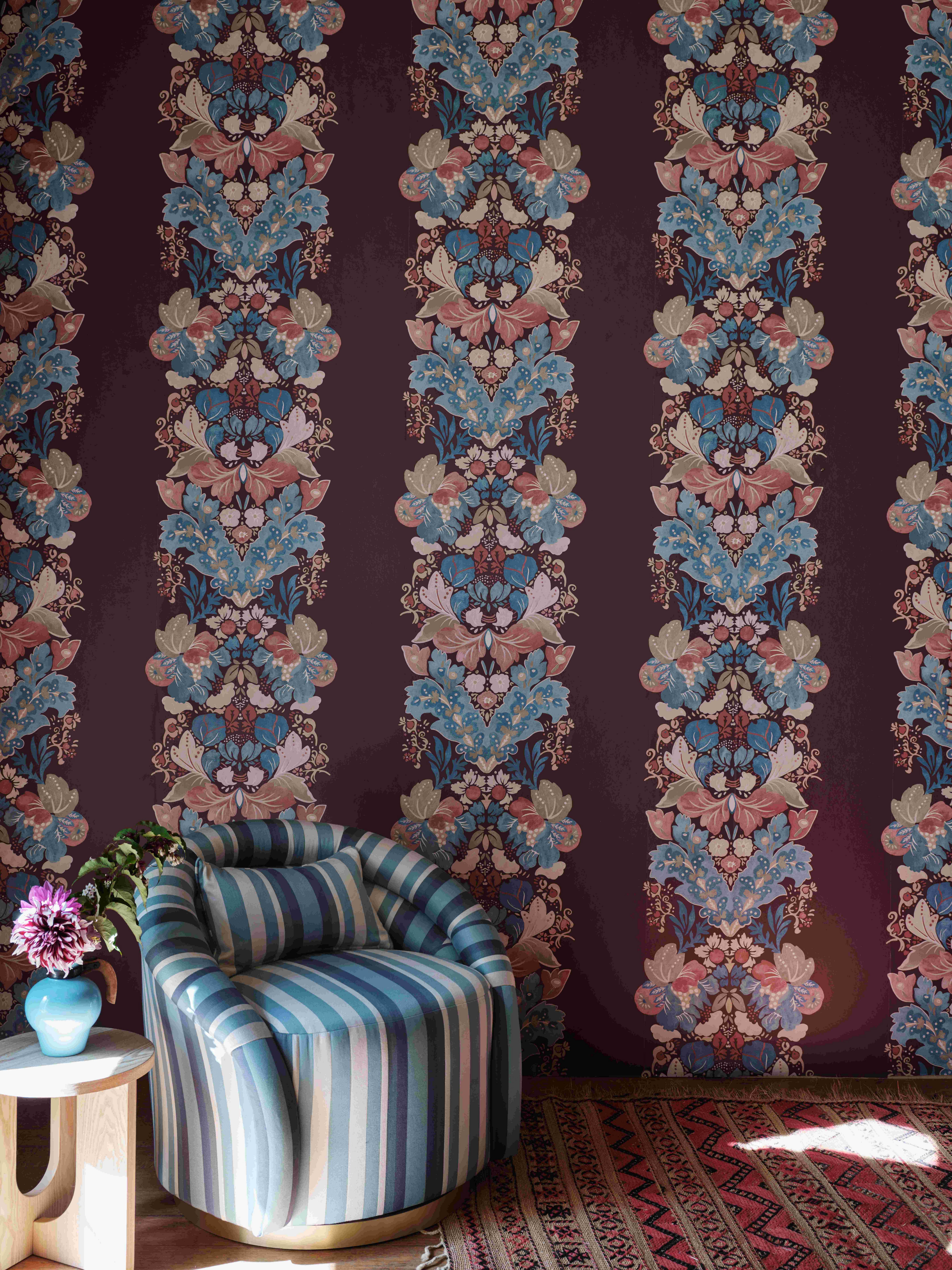
Blue + Burgundy
Navy blue and deep burgundy is one of those schemes that just works. Bringing a richness and sense of luxury to any room, whether in the form of all-over paint job or in a smaller way by layering cushions, this is without doubt a sophisticated look. To create a natural harmony between two contrasting colorways, pick a hero color or lead pattern first and build around it. This gives you a starting point from which to run with.
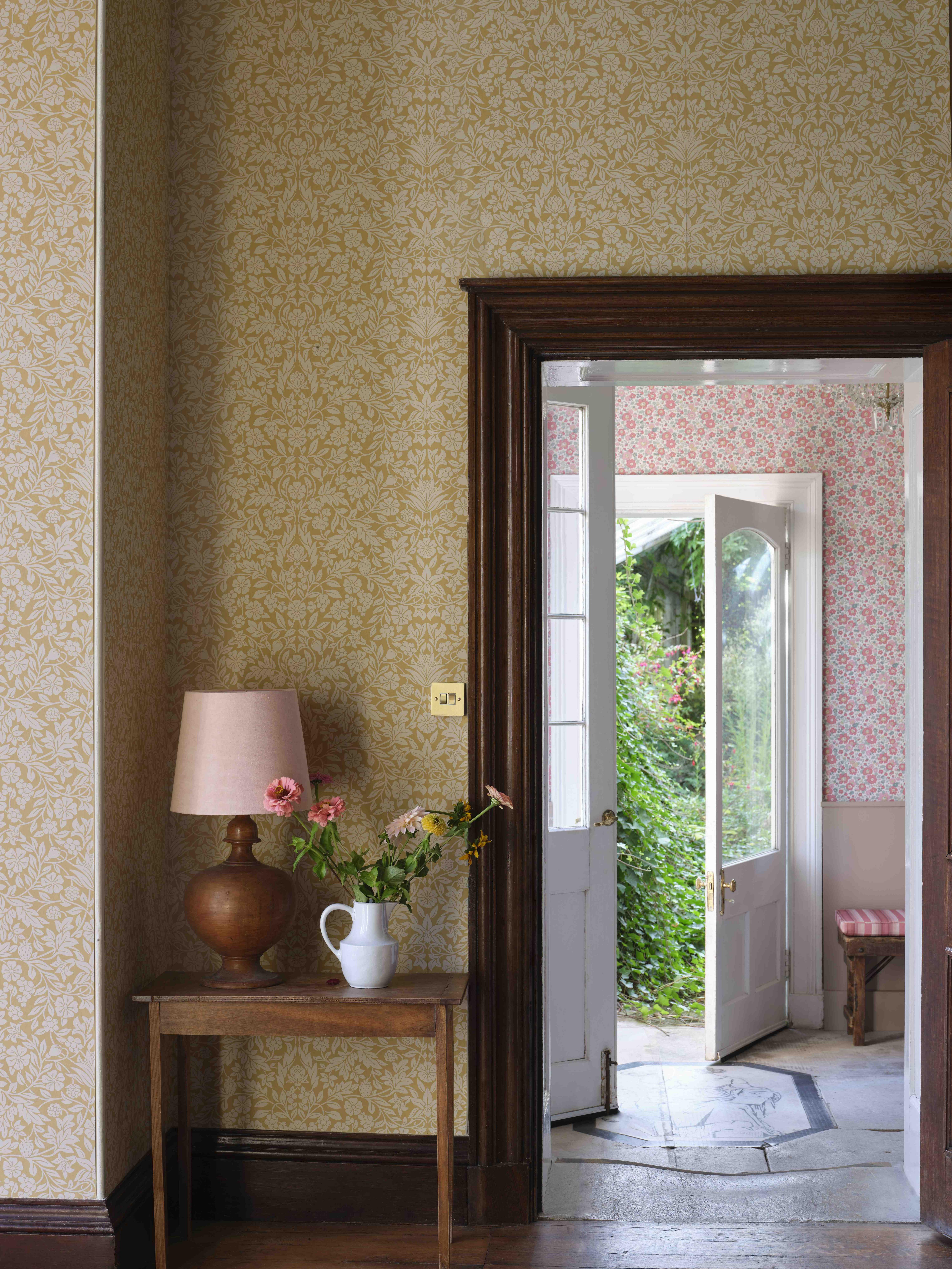
Orange + Beige
Lastly, look at the scale of your prints and choose something contrasting. Whether the pattern is significantly larger in scale or significantly smaller, choosing something with stark contrast will make the look feel more interesting. Adding in a neutral plain helps to give pause to a heavily patterned curation and allows prints to shine.
