Four Winning Formulas to Nail Colour in Your Home
Colour is the key to create a happy, cosy or calming space, but which are the combinations to experiment with now? Liberty knows…
By: Charlotte OlbyRead more
Four Winning Formulas to Nail Colour in Your Home
Colour is the key to create a happy, cosy or calming space, but which are the combinations to experiment with now? Liberty knows…
By: Charlotte Olby
When it comes to choosing colour combinations, striking the right balance can be tricky – particularly considering just how many tones and shades there are to play with. Colour schemes are the secret to making a home feel harmonious, giving it a sense of flow as you move between rooms, while also ensuring your space has personality and impacts your mood positively. There are a few key approaches used by experts (colour theory, colour wheels, analogous vs complementary to name a few) but it needn’t be quite so complicated. Let’s take the simple approach, with four foolproof colour duos you’re bound to love.
But first, a note. In order to achieve the best results with your colour combos, we recommend the 60/40 rule. Simply divide your palette into percentages, using one tone across 60% of the room (think: wall colours, flooring or furniture) and the secondary colour being designated to accent pieces like home accessories, cushions, lamps and wall art.
Blue + Burgundy
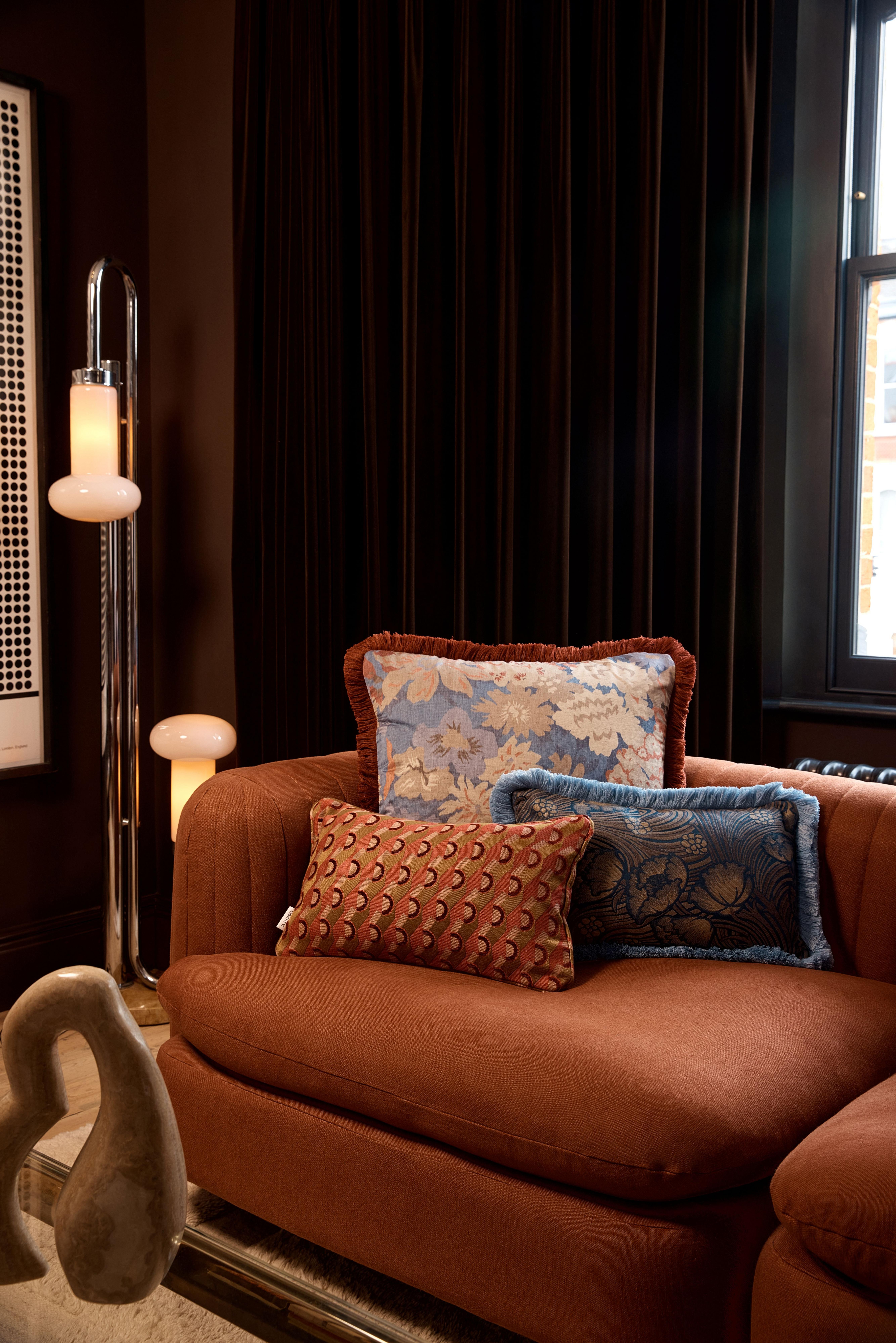
One of the joys of picking a new colour palette is discovering new combinations that just work, regardless of out-dated design rules. Navy blue and deep burgundy is one of those schemes. Bringing a richness and sense of luxury to any room, whether in the form of all-over paint job or smaller, colourful home accessories; this is without doubt a sophisticated look. While a lighter blue could make this feel saccharine, the inky tones of navy feel grown up. Coco & Wolf’s Thorpe Cotton Pillowcases, £99 uses a dense floral that evokes the classic style of ‘30s Liberty florals and brings this scheme to life (and bedtime).
Shop the Scheme
Coco & Wolf
D’Anjo and Thorpe Gathered Frill Edge Super King Bedspread
Cabana
Burgundy Speckled Vase
Free UK Standard delivery within 5 working days on all orders over £100
Peaches + Cream
For 2023, colour experts are focusing on slow colours, taking Scandi neutrals to new heights with grounding, soothing tones reminiscent of the earth. By including the soft pink undertones of peach and cream, you can inject a sunny disposition to your room all year round - bringing warmth to a space without being overwhelming. In many ways, peach is an incredibly versatile neutral, ripe for the picking and not to be dismissed as old-fashioned. Subtle yet strong, this palette will stand the test of time (and trends) and will create a physically soothing space that feels calming and cocooning.
Shop the Scheme
Maison Balzac
The Marble Hand Incense Holder
Free UK Standard delivery within 5 working days on all orders over £100
Ginori 1735
Il Seguace Orange Renaissance Candle 190g
Free UK Standard delivery within 5 working days on all orders over £100
Vilshenko
Summer Doll Scented Candle 230g
Free UK Standard delivery within 5 working days on all orders over £100
Maison Balzac
Pink Large Gobelet Set of Four
Free UK Standard delivery within 5 working days on all orders over £100
Elin PK
Espresso Martini Unframed Print 50x70
Free UK Standard delivery within 5 working days on all orders over £100
Pottery & Poetry
Dual Low Porcelain Candleholder
Free UK Standard delivery within 5 working days on all orders over £100
Liberty
Capel Blossom Linen Standard Pillowcase
Free UK Standard delivery within 5 working days on all orders over £100
Chocolate Brown + Green
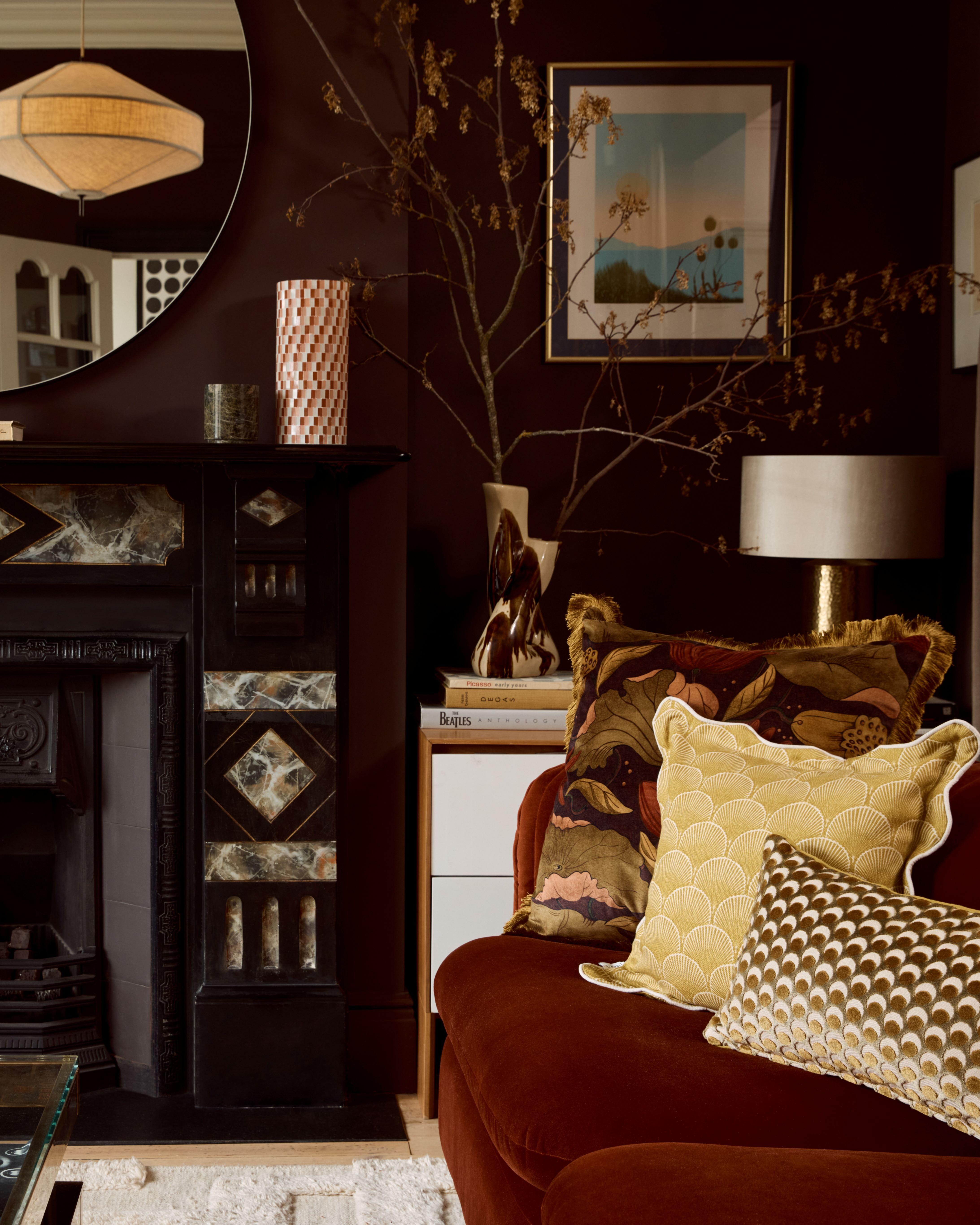
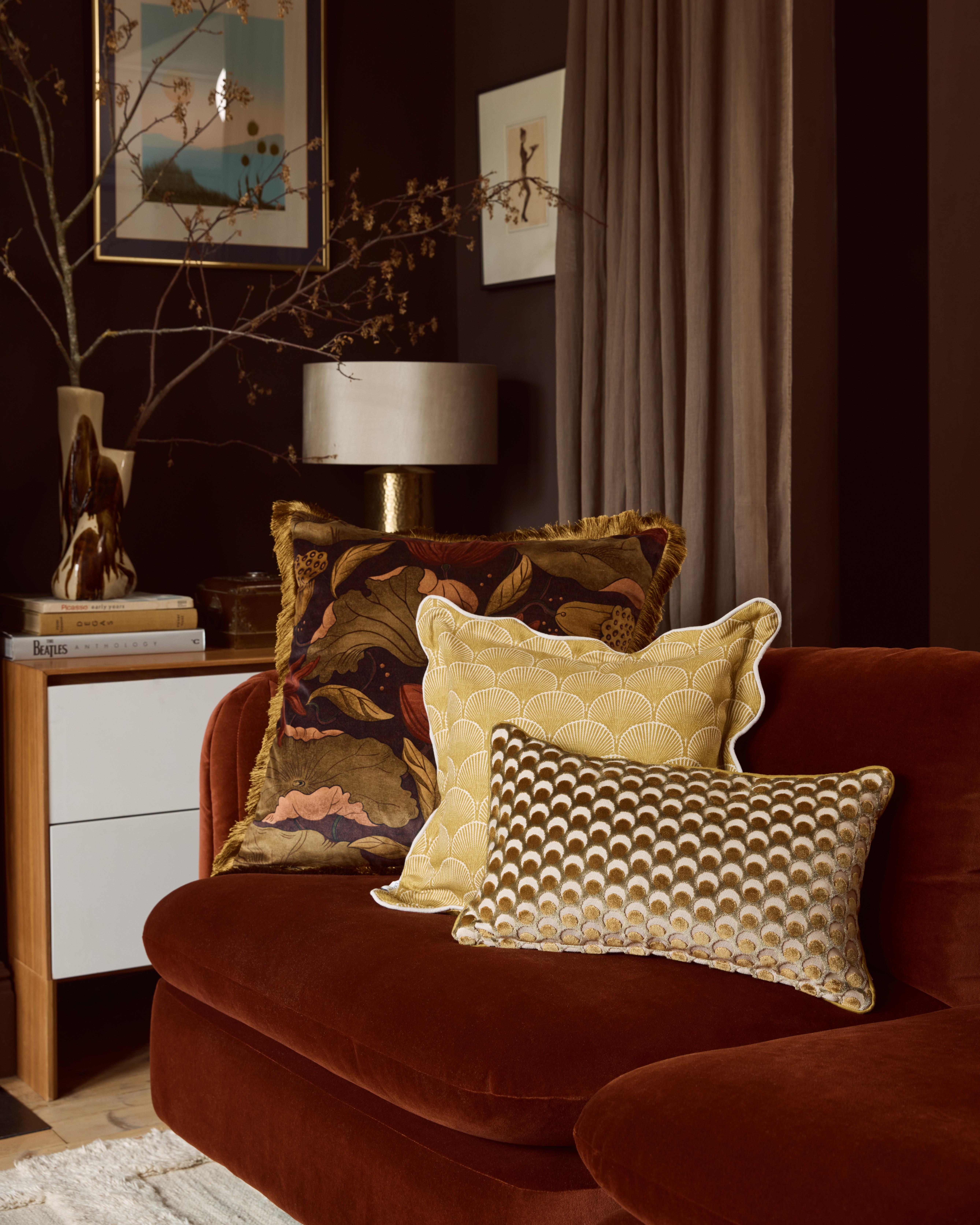
While you may think we’ve taken a fall and landed back in the 1970s, this distinctive style bears all the hallmarks of a relaxed home, full of richness and warmth. Embark on a commitment to earthy, velvety tones of chocolate brown with muted avocado greens to avoid this scheme looking too Mint Choc Chip. Soho Home’s ,Jermyn Small Chopping Board with Knife £60 hits the nail on the head with forest-green marble hand-cut from India. In a dark room without too much natural light, pair with neutrals and natural wood and try a gentle approach by choosing key home accessories to accent.
Shop the Scheme
Bordallo Pinheiro
Cabbage Dinner Plate
Free UK Standard delivery within 5 working days on all orders over £100
Cabana
Ginori Floral Charger Plate Green
Free UK Standard delivery within 5 working days on all orders over £100
Doing Goods
Large Rajah Tiger Head Rug
Free UK Standard delivery within 5 working days on all orders over £100
Miranda Boulton
Aftermath III Original Framed Painting
Free UK Standard delivery within 5 working days on all orders over £100
Omersa
Standard Leather Hippopotamus
Free UK Standard delivery within 5 working days on all orders over £100
Ginori 1735
x Luke Edward Hall Palazzo Centauro Candle 320g
Free UK Standard delivery within 5 working days on all orders over £100
House of Hackney
Dodo Verdigris Medium Velvet Tassel Cushion
Free UK Standard delivery within 5 working days on all orders over £100
Soho Home
Jermyn Forest-Green Small Chopping Board with Knife
Free UK Standard delivery within 5 working days on all orders over £100
Pink + Orange
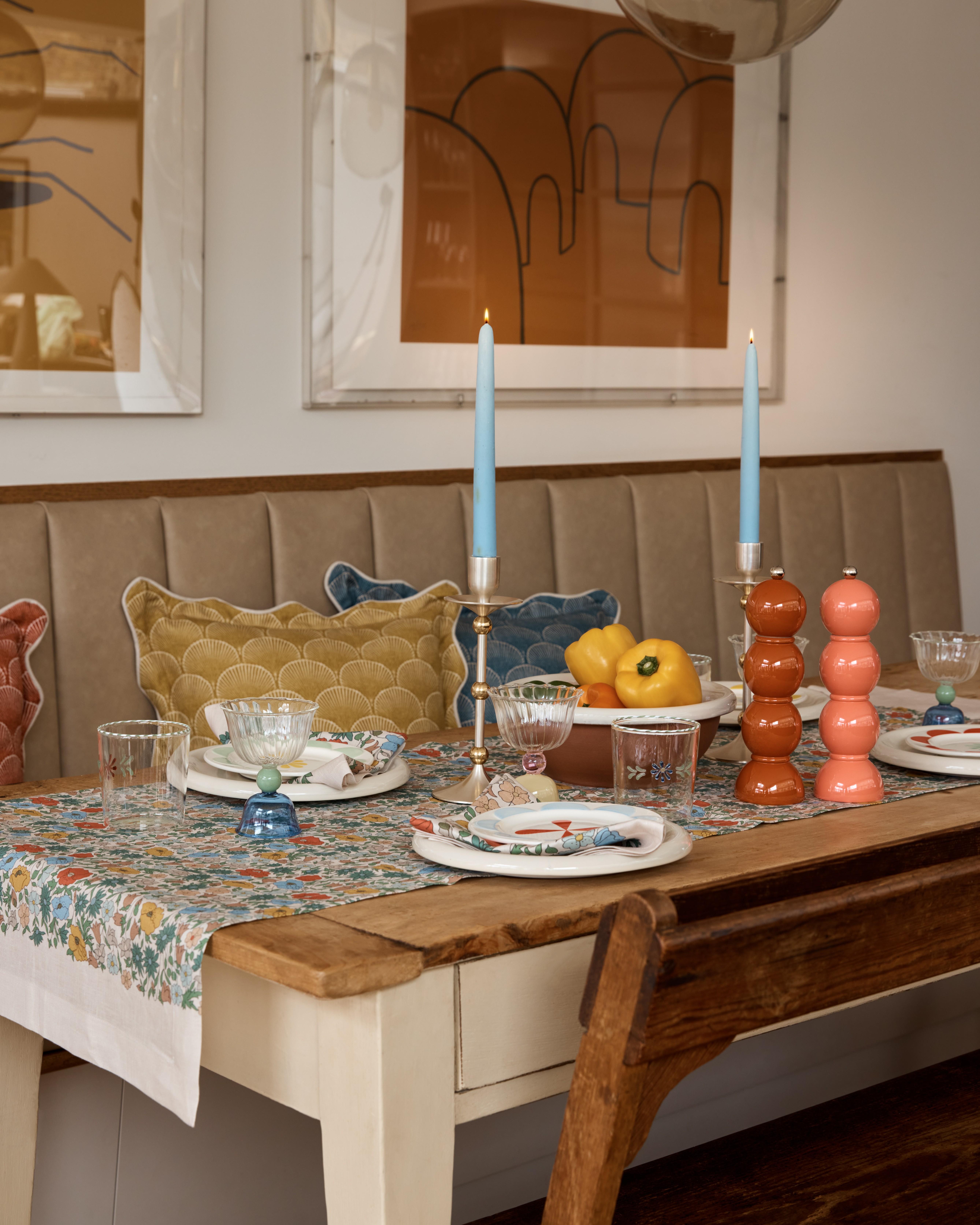
Some rules are made to be broken. Usually considered a clashing combo, due to the fact that they sit close together on the colour wheel, these uplifting tones can work harmoniously together when executed carefully. Vivid pinks and oranges can appear too saturated and brash to the eye so try softening your pinks and allow a fiery, sunset orange reign supreme. Projektityyny’s Pohjola Honeycomb Patchwork Quilt, £380 embodies this colour scheme perfectly, revolutionising sofa sitting and slumbering.
Shop the Scheme
KLIMCHI
Hobnail Tumbler
Free UK Standard delivery within 5 working days on all orders over £100
Ginori 1735
Il Frate Orange Renaissance Incense Burner Set
Free UK Standard delivery within 5 working days on all orders over £100
Doing Goods
Pink Leopard Print 220x140cm Tablecloth
Free UK Standard delivery within 5 working days on all orders over £100
Maison Balzac
Amber Large Gobelet Set of Four
Free UK Standard delivery within 5 working days on all orders over £100
Coco & Wolf
x BeauVamp D’Anjo Pink Tiffany Ruffle Lampshade
Free UK Standard delivery within 5 working days on all orders over £100
Projektityyny
Pohjola Honeycomb Patchwork Quilt
Free UK Standard delivery within 5 working days on all orders over £100
