At Home with: A Considered Space
Eleanor Cording-Booth of @aconsideredspace opens the doors to her Barbican flat.
Read more
A Considered Space
Eleanor Cording-Booth of @aconsideredspace opens the doors to her Barbican flat
Shop Eleanor's EditBy: Team Liberty
When it comes to home styling, Barbican-based Eleanor Cording-Booth - the interiors writer and consultant behind @aconsideredspace - seamlessly fuses the Brutalist ‘70s architecture of the iconic estate in which she lives with eclectic antiques and warm, earth-toned pieces. The result is an inviting, ‘considered space’ that’s all her own. Step on in…
How long have you lived in your Barbican flat? Who do you live here with?
I’ve lived in the Barbican Estate since 2014 but only in this particular flat for two years. We rent, which has its downsides in terms of flexibility to decorate but also means I can hop around and try different buildings and flats around the estate when I feel like a change. I live here with my boyfriend, Tom, who currently works from home in our windowless hallway. Like most small-space dwellers will have discovered over the past year, any old space wide enough for a desk has suddenly become an office!
How would you describe your interior aesthetic? Is it shaped by the iconic estate you live within?
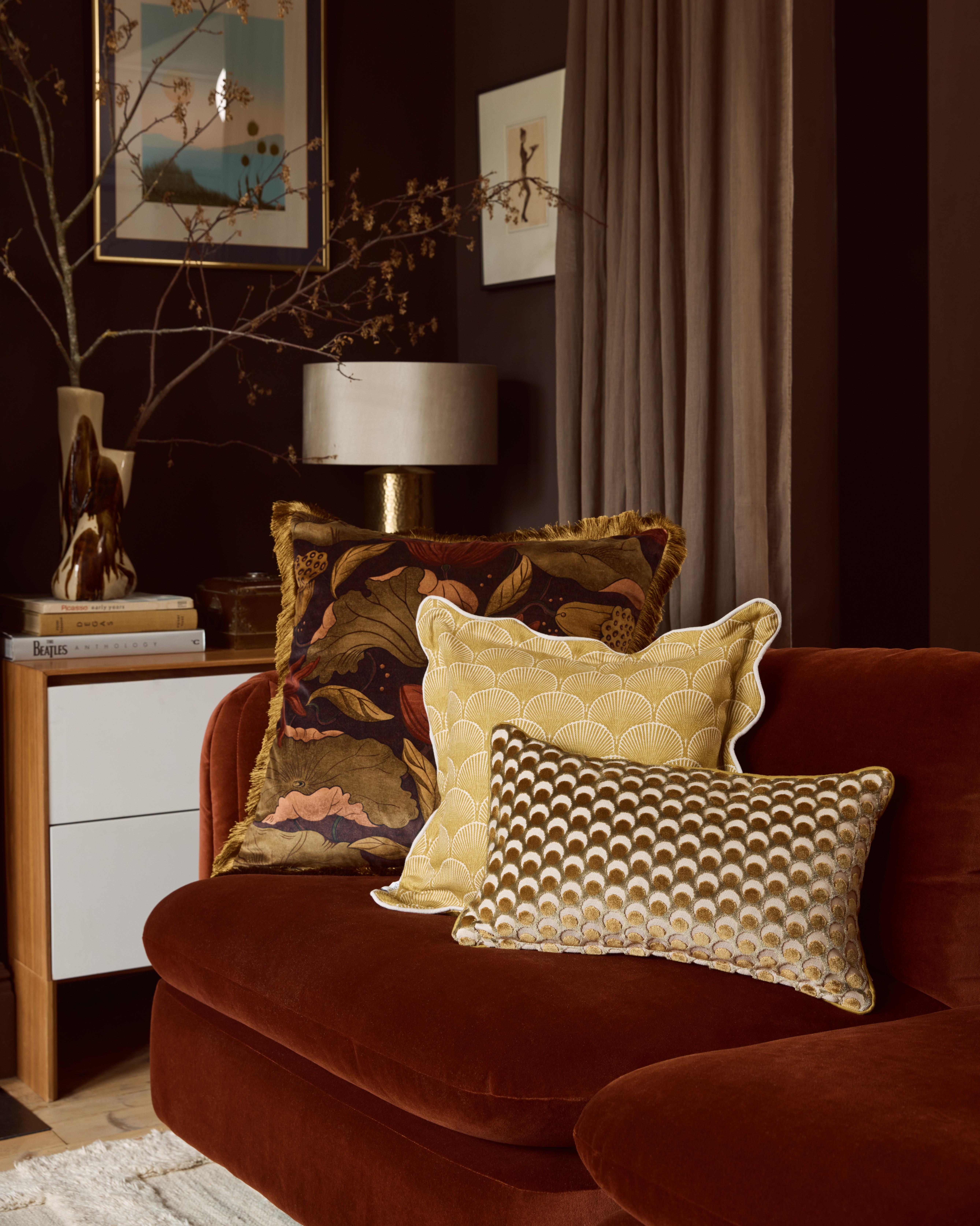
Yes and no. My natural aesthetic actually clashes terribly with the Brutalist architecture, sharp angles and Mid-Century styling of the Barbican Estate. At heart, I’m probably better suited to a characterful period property or old cabin by the sea as I’m always drawn to earthy, weather-worn colours, clashing stripes and curvaceous antique pieces that in the boxy surrounds of my plain white flat, can really jar and look out of place. An example would be Swedish Gustavian furniture or anything too overtly feminine. I love it but it’s a stretch to make it work.
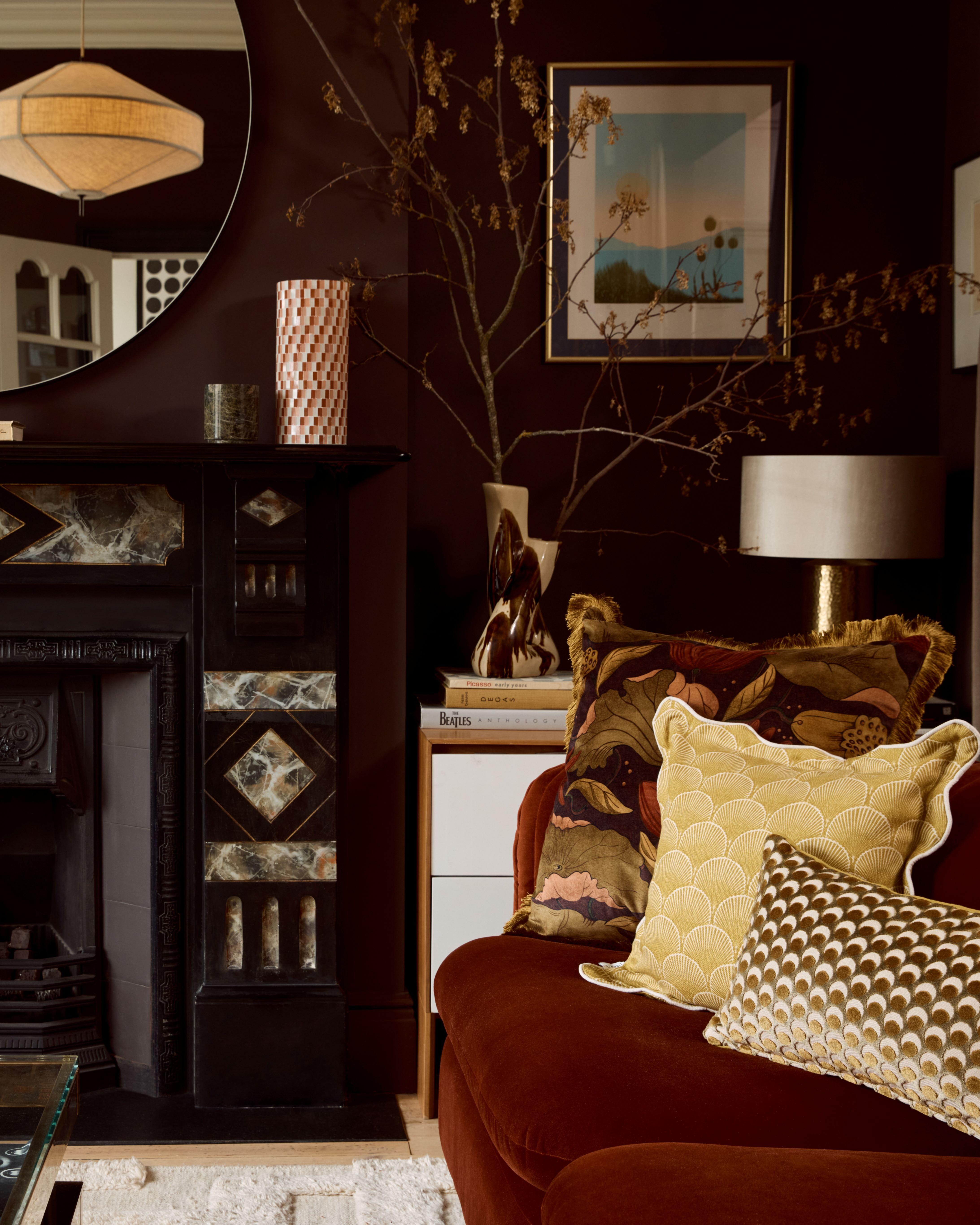
The Barbican definitely steers you down a path of clean lines and teak. Lots of teak. Some people who live here end up decorating like they’re trapped in a 1970s time warp, or they go down the Danish route of minimalism and iconic (very expensive) furniture design. I actively avoid both of those things and just buy what I like, as we won’t live here forever. Our clinical white and stainless steel kitchens (we still have the original 1970s kitchen and bathroom in our flat) were installed by yacht designers Brook Marine, so something charming like a skirted sink would be out of the question. For that reason, my interior aesthetic has to be somewhat guided by the architecture and I do incorporate the occasional Mid-Century piece to keep the balance.
In which room do you spend the most time?
We only have two rooms – the living room and a bedroom. Our kitchen is galley-style and doesn’t have any natural light, so I dodge that unless I need to be in there! I spend literally all day on ‘my’ side of the sofa, closest to the window as my mood is hugely affected by natural light and much like a cat, I like to be sitting in the sunniest spot. I don’t have a desk (though I am trying to work out where I can shoehorn one in), so there’s a permanent bum-shaped dent where I work all day and then watch TV in the evenings. I love our living room because of the huge floor-to-ceiling windows but I would definitely appreciate it more if I had a separate office space for the daytime.
My natural aesthetic actually clashes terribly with the Brutalist architecture, sharp angles and Mid-Century styling of the Barbican Estate.
How did you go about decorating/furnishing each room?
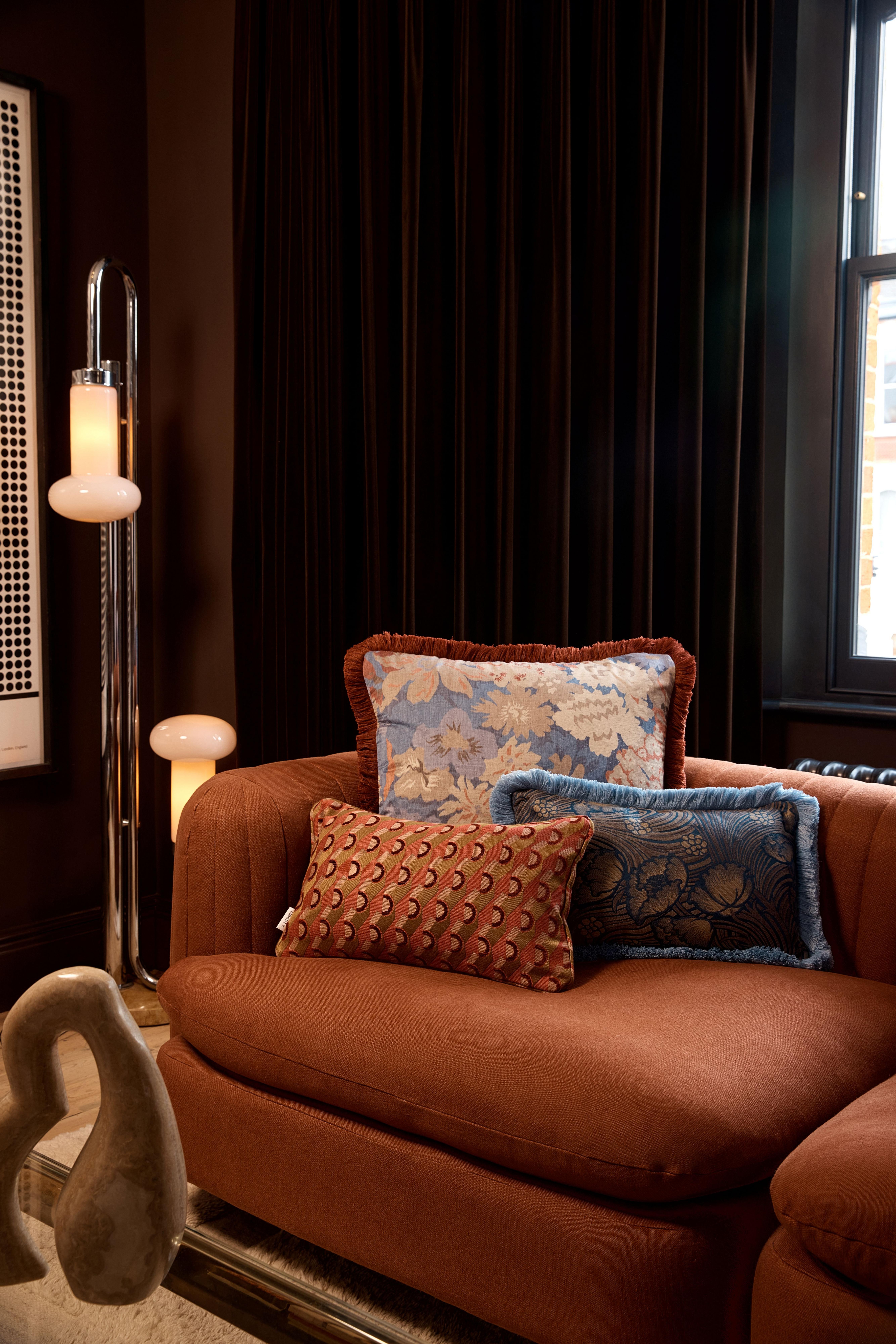
I’d love to say there was a plan or a scheme or some semblance of intention but honestly, I just buy things as and when I see them and hope for the best! There are exceptions of course when I *know* something won’t work because of space constraints or when there’s already too much of a specific thing in a room, but otherwise I shop spontaneously. I prefer to decorate my own flat this way – it feels more eclectic and true to my million-thoughts-at-once nature to accumulate as I go without a plan. I have lots of memories attached to the pieces I own as they’re either vintage bargains, special pieces I’ve saved for or had made for me, or they’re things I’ve bought on holiday. I love having plenty of ‘stuff’ within eyeshot that makes me feel uplifted when I see it. I don’t care if my flat doesn’t look like there was a well-planned scheme or whether I’m breaking any design rules. I just trust my instincts. The one thing I won’t compromise on though is comfort. A room has to feel cosy and it has to be softly lit with plenty of lamps. The ‘big light’ is banned in our flat!
Do you have any go-to interior brands?
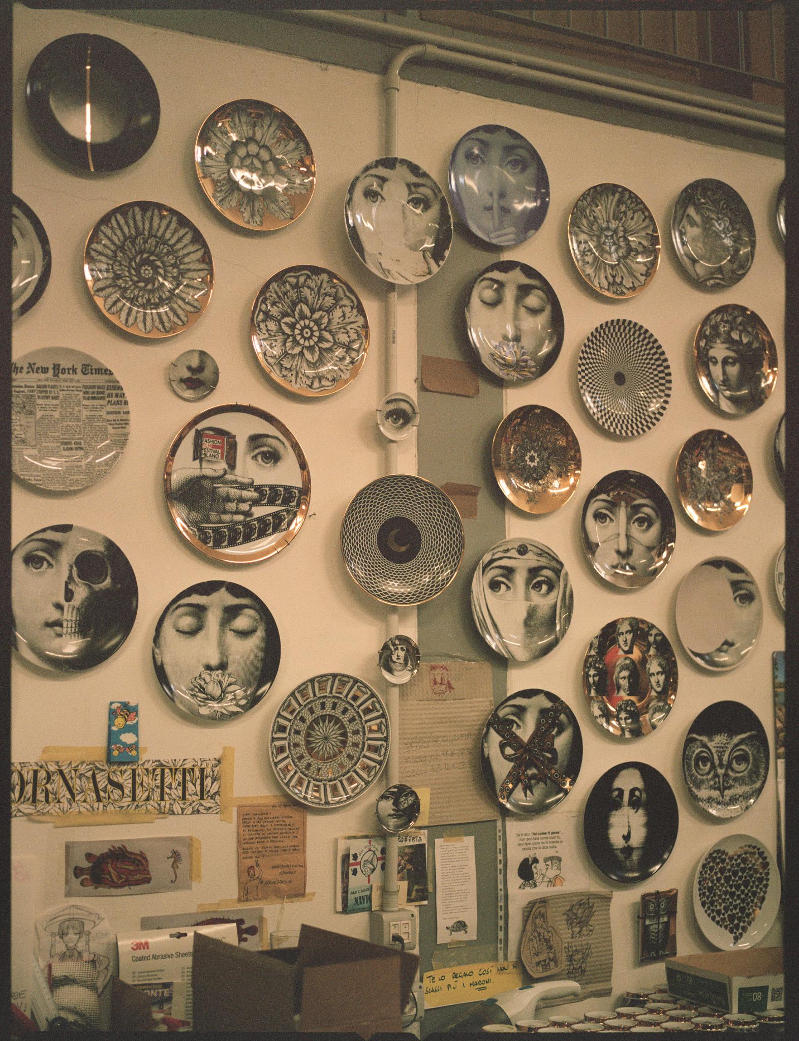
The brands and shops I truly love aren’t the ones I can buy everything (or anything) from. If money was no object, I’d go wild with a supermarket sweep of high-end names from the Pimlico Road such as Pinch, Howe London, Rose Uniacke and Soane Britain. The reality of my budget, however, means I buy mostly vintage and secondhand, then I splash out on well-made pieces from the makers I really love (including some of the names above – I’m happy to invest in skilled craftsmanship and smaller brands as often as I can afford to). When I’m shopping in Liberty, I make a beeline for Astier de Villatte – I’m saving for a vase!
Are there any interior trends you’re particularly into right now?
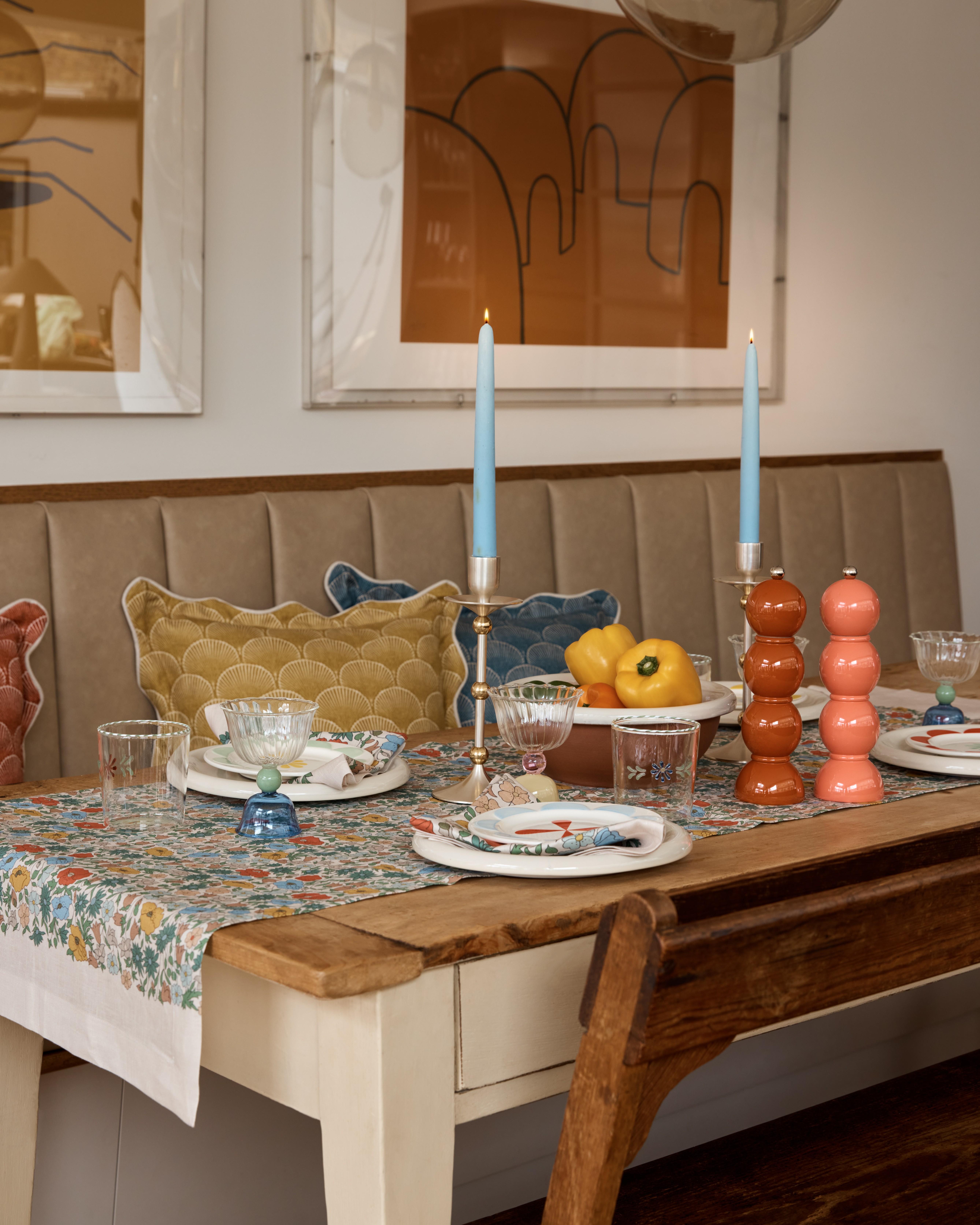
I get a bit itchy at the idea of trends to be honest, though I certainly own lots of pieces that would be considered on-trend at the moment (chequerboard, bobbin legs, shells, marbled ceramics, wavy edges, coloured glassware, even potted geraniums – I’m ticking them off like a bingo card as I look round the room I’m sitting in). Instagram creates intense hype around micro-trends, so even when something isn’t the height of chic when you first buy it, it can quickly become very desirable and that once-unusual style you found is popping up everywhere, whether you like it or not! A few current trends that I like but haven’t utilised personally are plaster lighting, patchwork quilts, limewash paint, paper flowers and seating covered in cream boucle or shearling.
Are you drawn to specific colourways or design styles?
I am relentlessly drawn to stripes and the colour blue – specifically a mid-denim-ish blue. Commune Design over in the US uses the colour a lot and it also makes me think of Japanese and African indigo-dyed cloth. Aside from that, I love earthy colours like green, browns, ochres. Anything autumnal and muted. In terms of material, I always make a beeline for really slubby textured linen, interesting coloured or patterned lucite or acrylic and brass hardware. I also love wicker baskets, rattan chairs and tables and tatty Swedish or Dutch painted furniture – the type of thing you could imagine popping up in a project by Beata Heuman or a house occupied by John Derian. I love so many different aesthetics, from an old Americana type vibe that you’d see in New England or upstate New York (I’m picturing Orchard House in Little Women) and also chic Scandinavian city apartments, Moroccan riads and eclectic English country cottages. I love it all!
Where do you look for inspiration?
I used to work in travel (which remains a huge passion of mine) and I’m very driven by design that reminds me of memorable trips I’ve taken and favourite hotels I’ve stayed in. I love watching films and I’m always snooping at the set design in the background. I definitely romanticise about times gone by (before I was even born) and how homes looked then when everything was made to last.
I subscribe to a few interiors magazines and I buy lots of design coffee table books, but of course the most accessible place to find design inspiration is Instagram. I’m guilty of picking up my phone before I pick up a book and I’d only be trying to sound more sophisticated than I really am if I said otherwise!
