
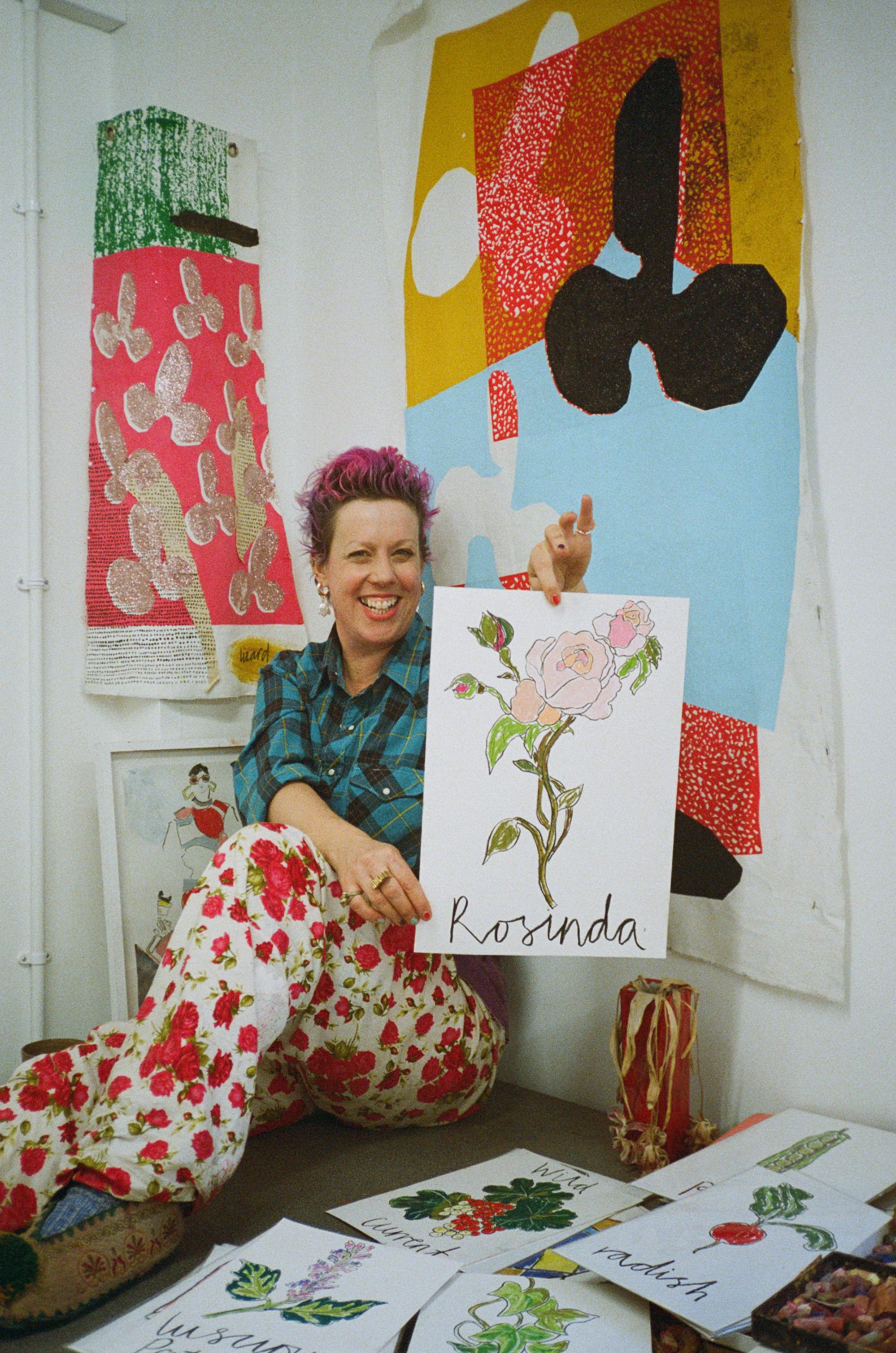
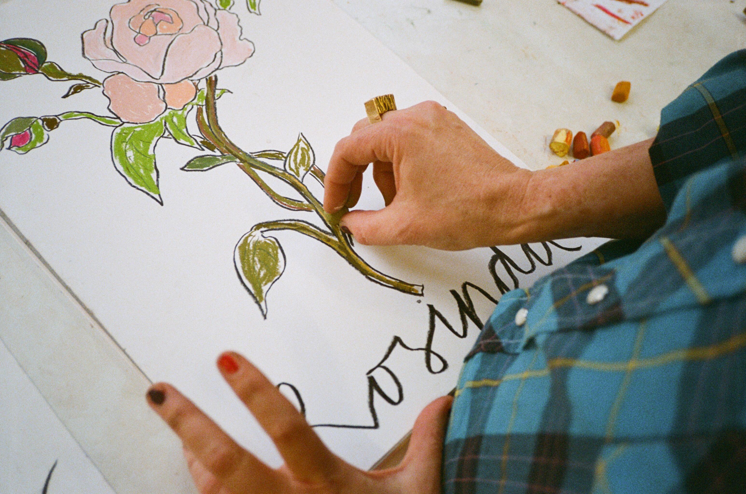
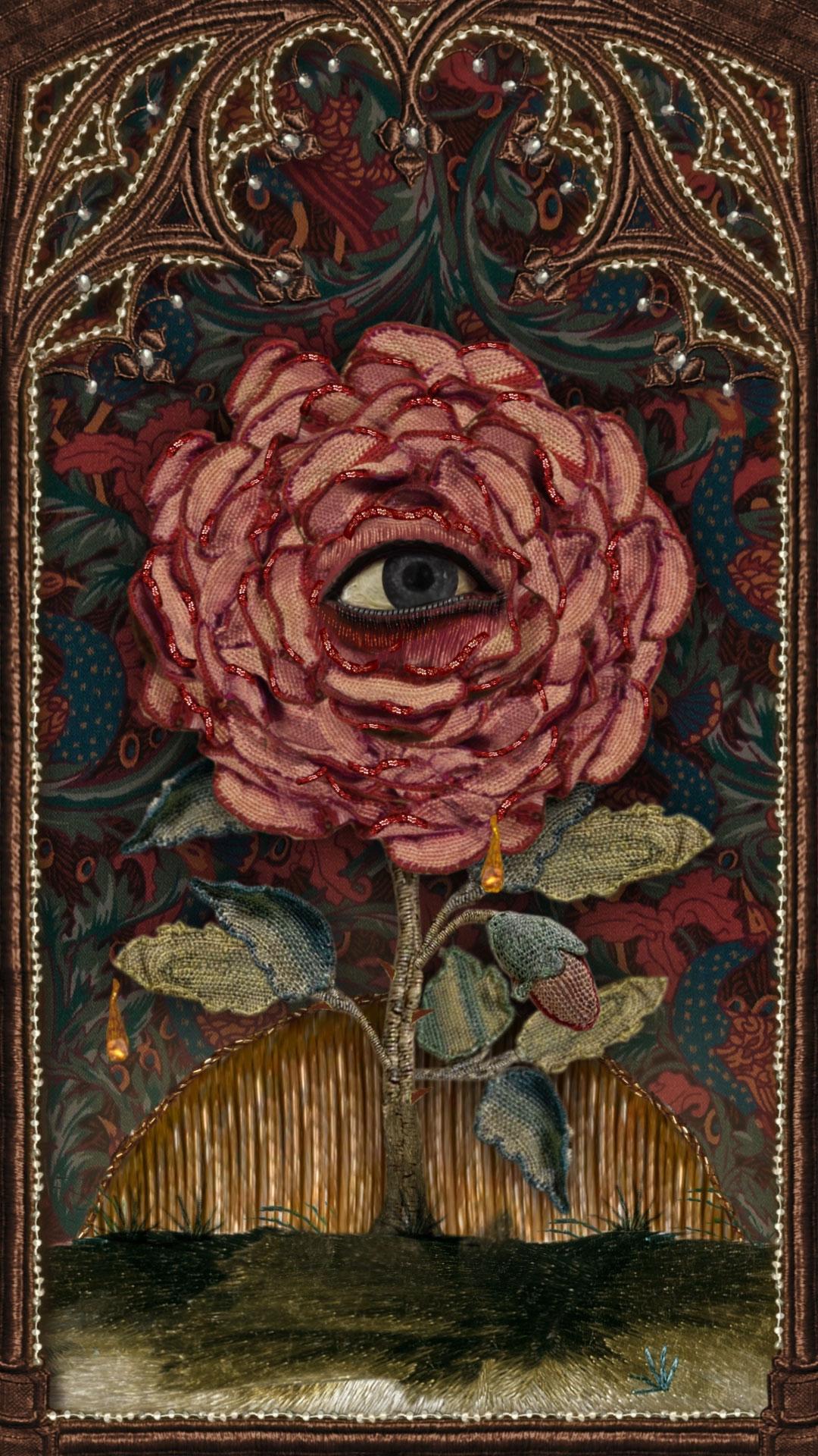
Inspired by LBTY: Wild Rosinda by Helen Bullock
The fashion illustrator and artist applies her signature spontaneous energy to our contemporary take on the rose.
Read more
Inspired by LBTY: Wild Rosinda by Helen Bullock
The fashion illustrator and artist applies her signature spontaneous energy to our contemporary take on the rose.
A deep-rooted passion for artistic expression lies at the heart of Liberty, from the Tudor foundations of our store upwards and outwards. The exquisite world of Liberty’s LBTY. Fragrance is no exception, guided by a passion for creativity and collaboration, celebrating history and heritage with an eye to the future.
And what better way to explore the intricacies of the Liberty’s LBTY. Fragrance collection than by continuing our close collaboration with the creative world? This year, we’re tasking a series of contemporary creatives with reimagining each scent through their unique artistic media as part of our Inspired by LBTY. series.
Helen Bullock’s illustrations are beloved by fashion’s finest names. The London-based artist and illustrator has collaborated with the likes of Vivenne Westwood, Louis Vuitton, Burberry and ShowStudio – as well as Liberty.
A graduate of Central Saint Martins, Bullock’s works are energetic, bold and joyful, toying with the balance of playfulness and sophistication as she moves from subject to subject. Most recently, she tasked herself with journeying through the alphabet letter by letter, crafting a series of artworks as she progressed.
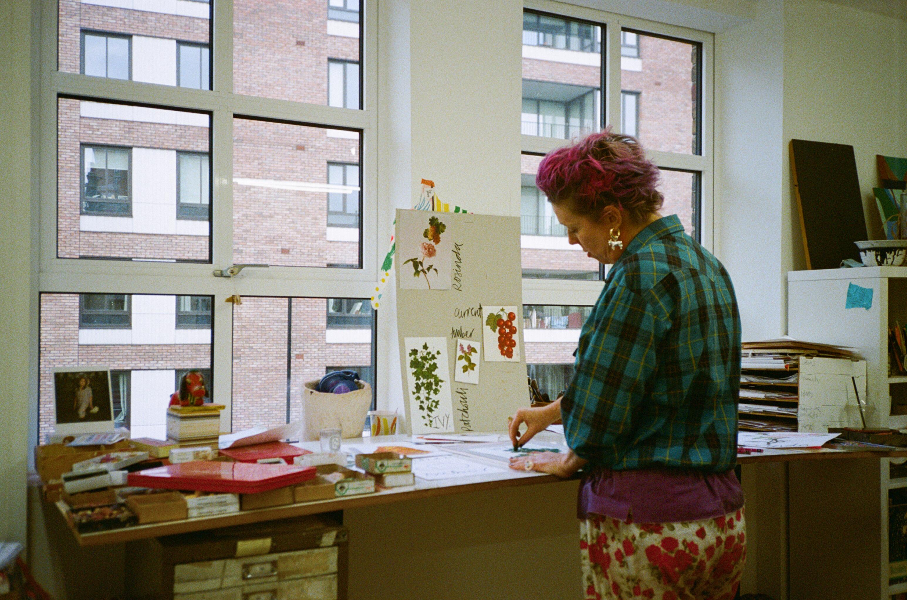
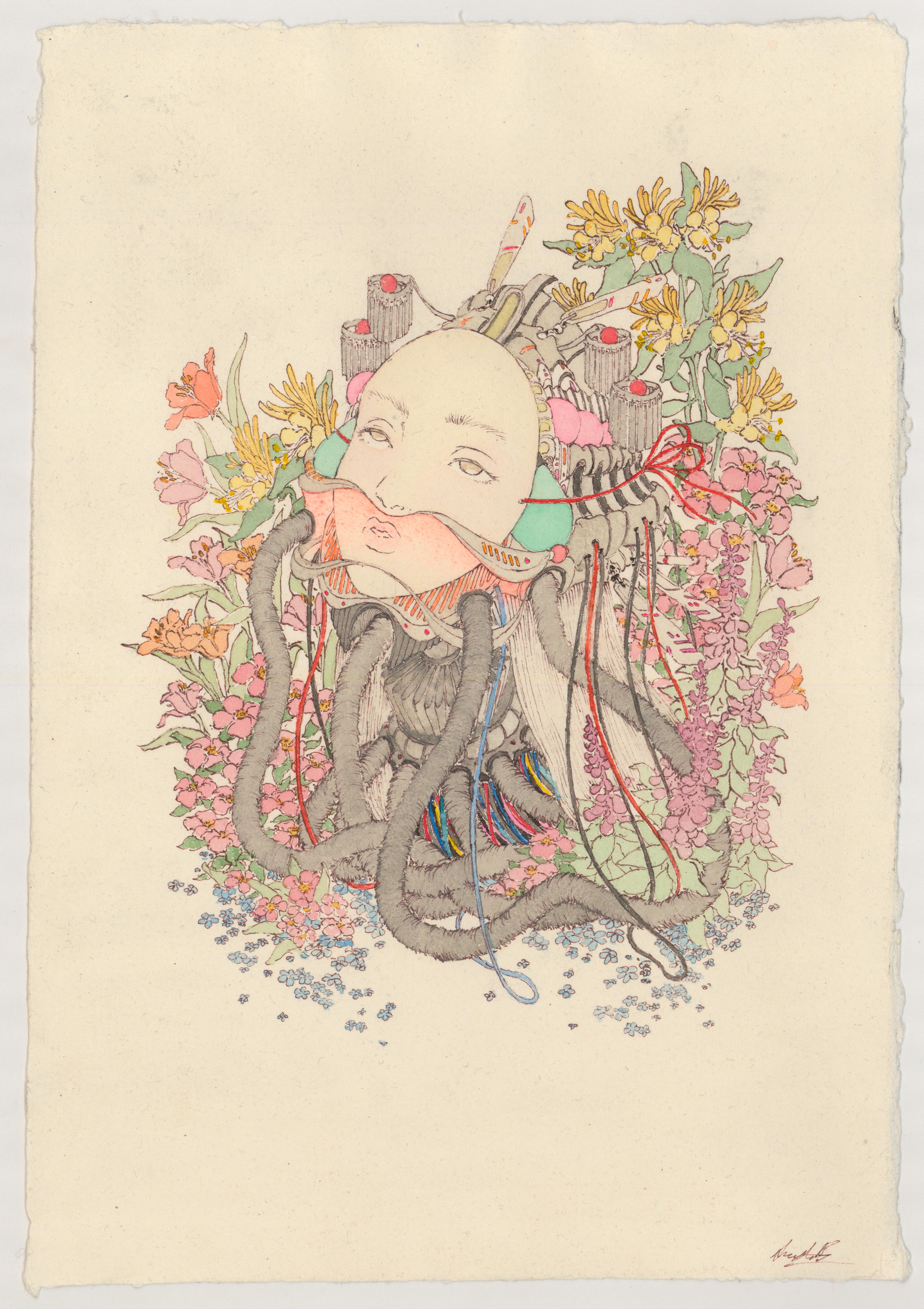
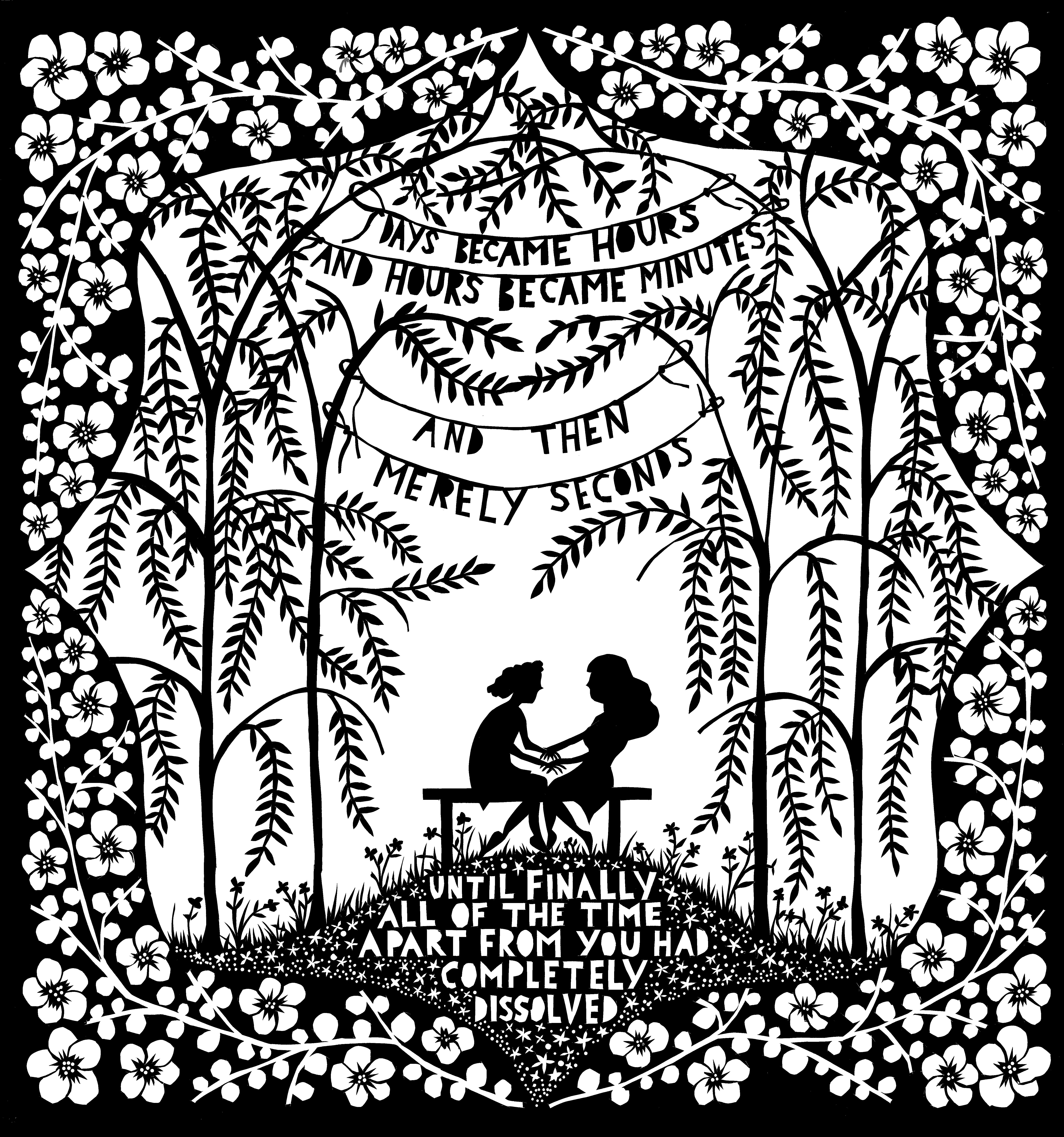
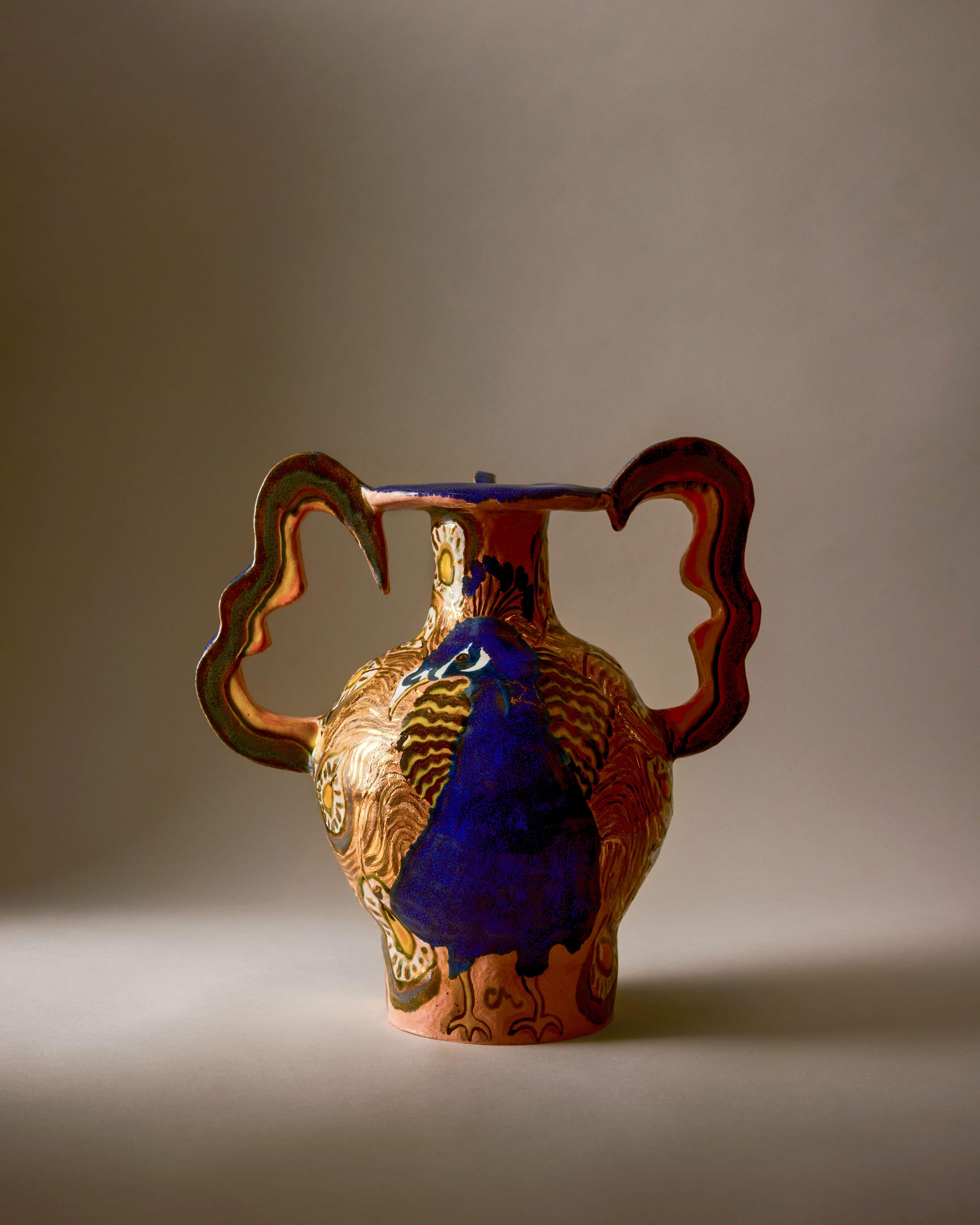
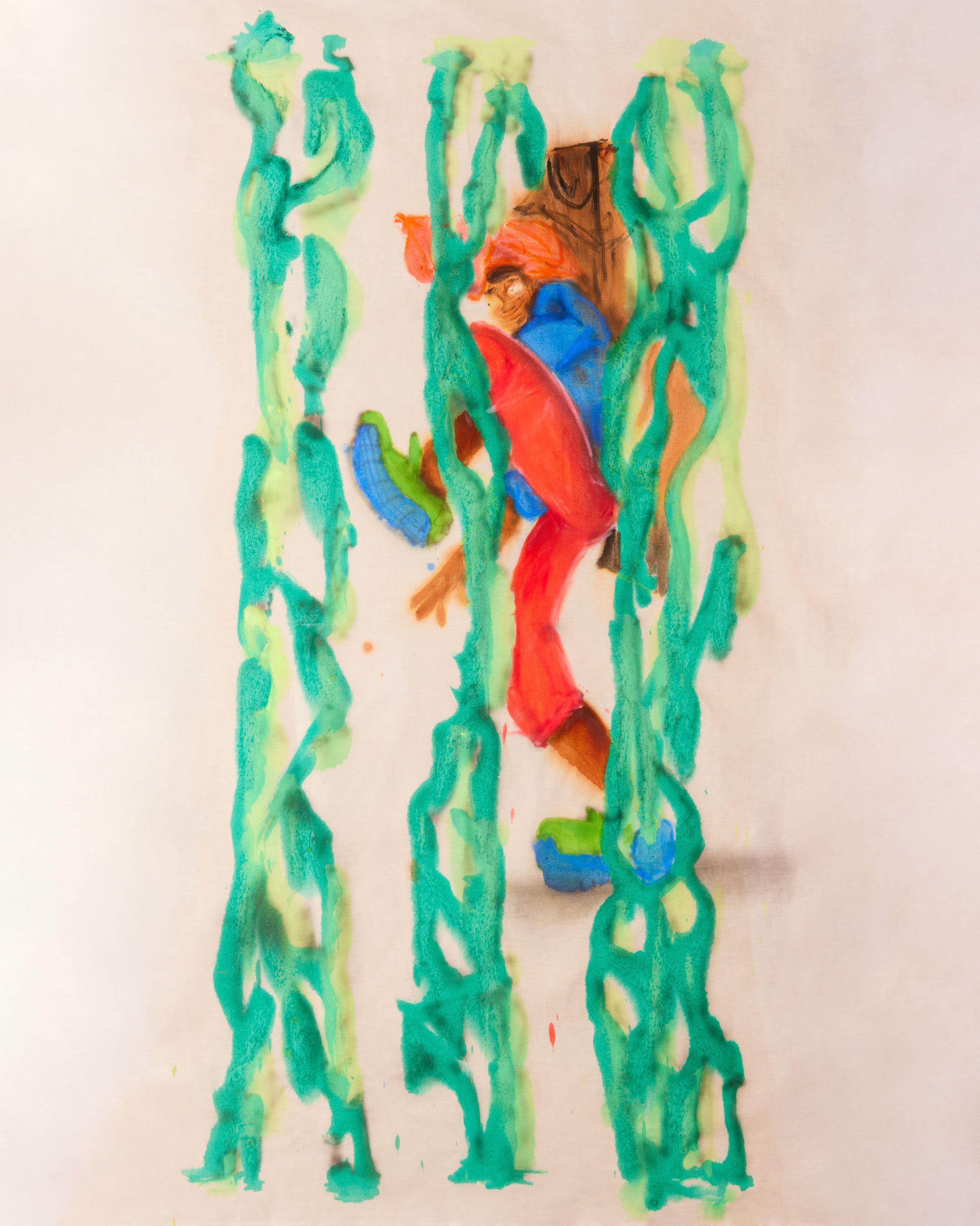
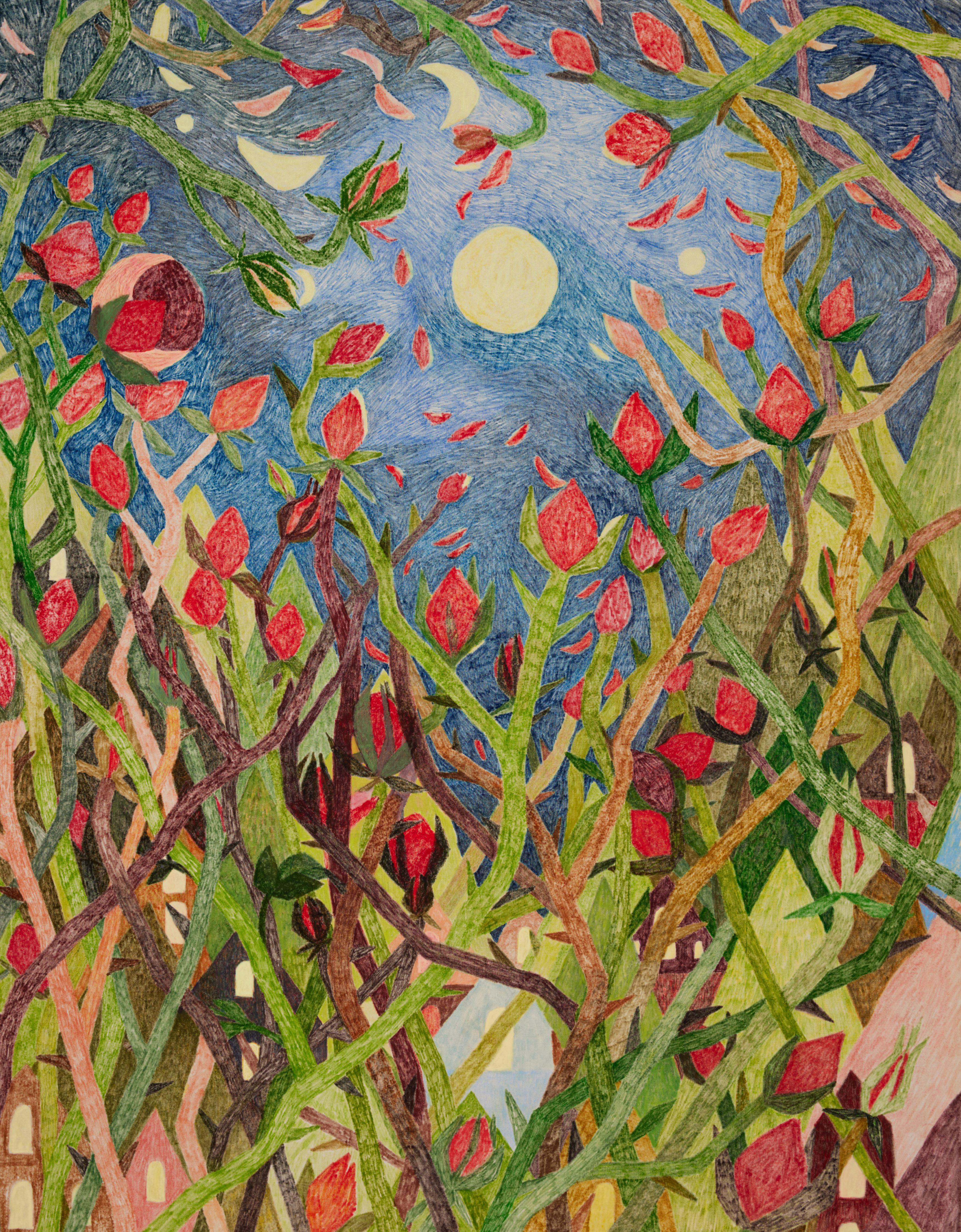
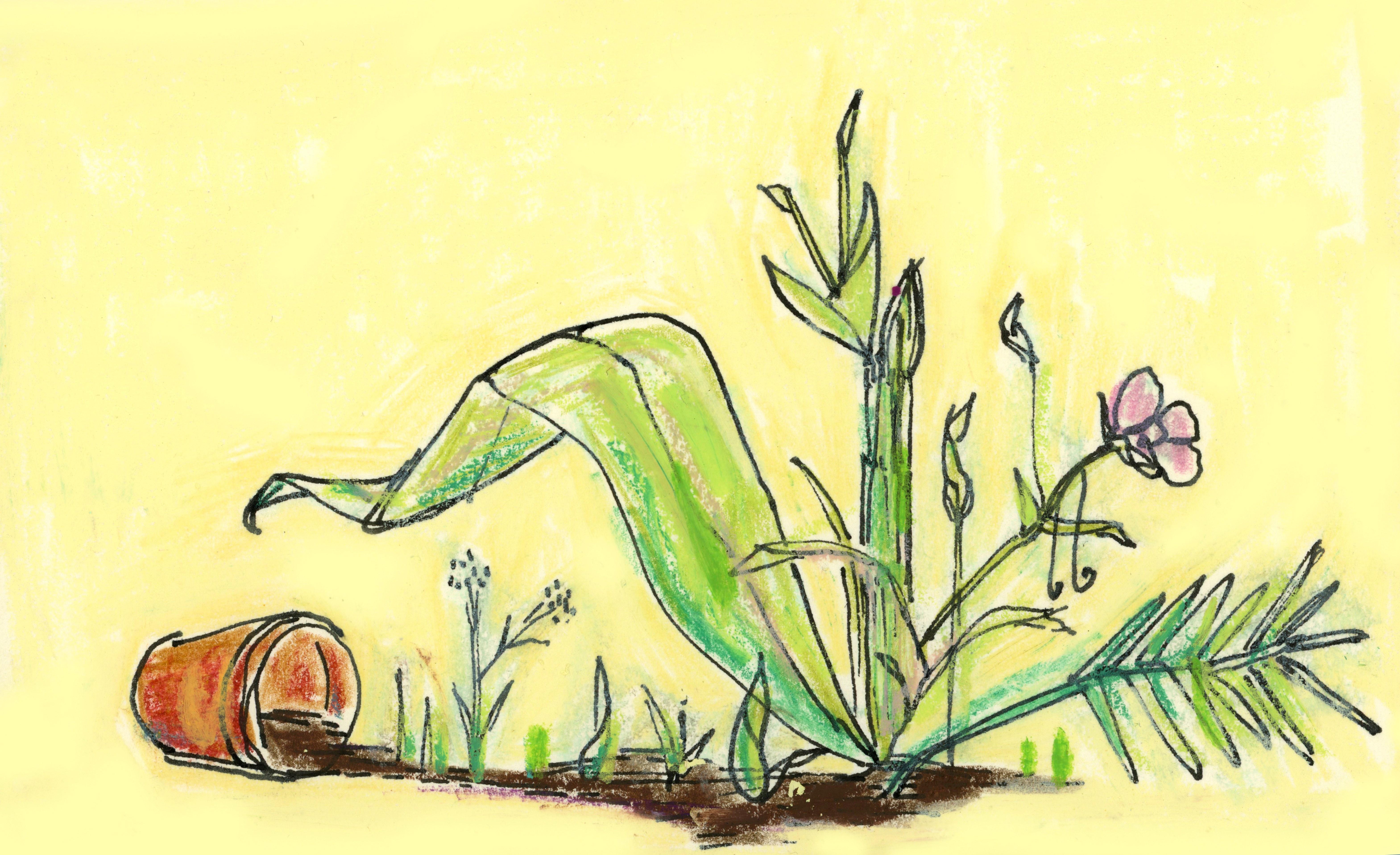
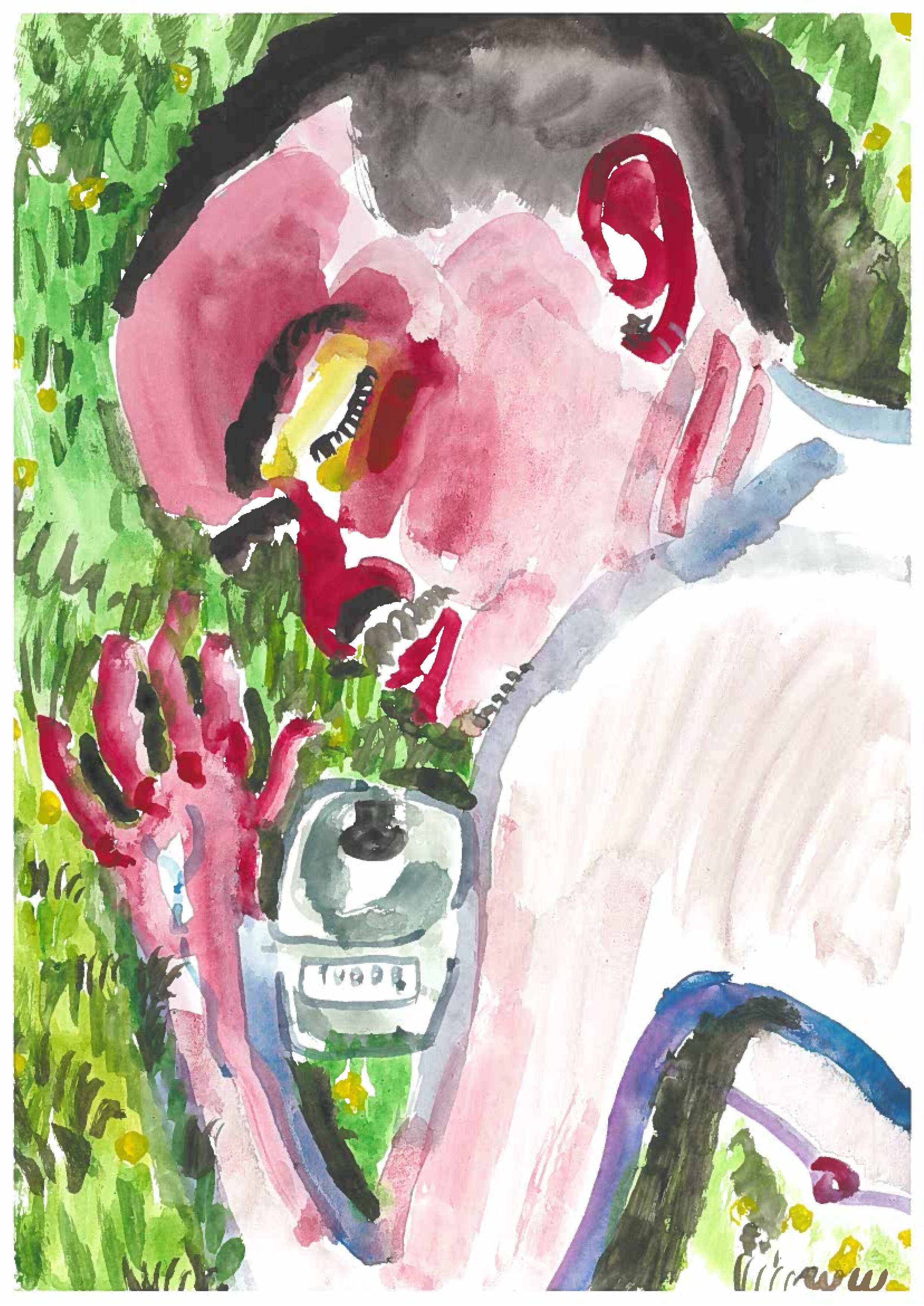
In her works inspired by Liberty LBTY. Fragrance’s ode to the rose, Wild Rosinda, Bullock looked to her alphabet series as a starting point, capturing the scent’s complex, captivating layers in five evocative illustrations.
Liberty paid her a visit in her London studio, to discuss more about her work and the inspirations behind her artworks.
?fmt=auto&qlt=default)
?fmt=auto&qlt=default)
?fmt=auto&qlt=default)
?fmt=auto&qlt=default)
?fmt=auto&qlt=default)
Can you describe your work and your style?
Joyful.
Some people might dismiss my style as naïve or childlike, but I believe my work has depth. I certainly have the ability to create a more sophisticated outcome when necessary, depending on the subject. I think my work is authentic, with a strong use of colour.
The most important thing for me is to have a connection with whatever I am drawing—that is what truly influences my work.
Why do you do what you do?
I think I do what I do to bring joy—primarily to myself, but mostly to others. I receive really nice comments and feedback from people saying that my work makes them happy. Although there may not be much depth to that, I am more than satisfied if that is something my work can achieve.
How do you create joy within a piece of artwork?
I think the immediacy of my work resonates with the viewer straight away. This is definitely through my use of colour, my line work, and my spontaneity. I would like to think that my work is authentic, and I try to come from a place of joy in my life in general. Hopefully, that translates into my art.
How did you start your alphabet series?
The alphabet series started during lockdown. I vividly remember walking down the street when the idea just came to me—it felt like a gift.
I had previously worked with the designer Mira Mikati, often creating illustrative objects for her that would then become larger prints, and I always really enjoyed that. Walking can give you great ideas, and I kept coming back to the concept. I wanted to give myself a project — it was lockdown, it was quiet, and it felt like a challenge.
The series celebrated the everyday and the importance of things we often take for granted. I completed the first batch, posting one piece every month, and the response was fantastic. People started sending in suggestions, and it snowballed from there. It was just so much fun, and it worked really well for me.
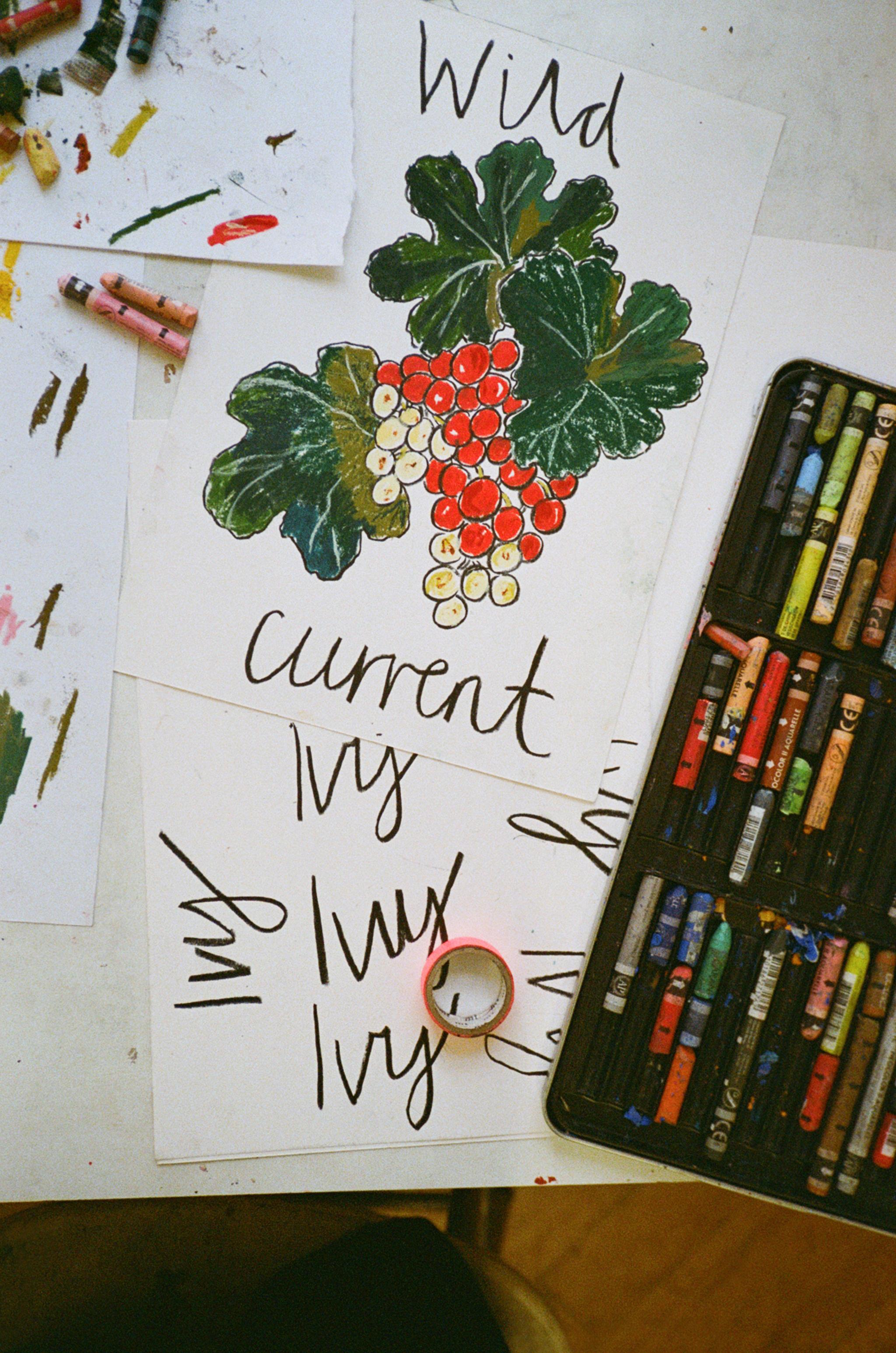
Tell us about your artwork for Wild Rosinda. How did you bring the scent to life?
I used the alphabet as a format, which I thought was a great way to explore the ingredients — or notes — of the perfume. The immediacy of this approach allows viewers to experience the scent visually, even if they have not smelt it themselves.
For example, the wild currant is rich and bold, while the ivy represents a lighter scent. Amber, on the other hand, is deep and decadent. I wanted the viewer to understand the perfume’s composition in a way that is immediate and evocative.
What does it mean for you to be working with Liberty?
Liberty has always been a dream client, and I have a long-standing connection with the store. In 2014, I had one of the best experiences of my career when I designed their window displays for London Fashion Week. It was one of my first major commissions as an artist, and it confirmed my perception of Liberty as a welcoming and inspiring community. I was embraced during my time there, and it felt like being part of a family.
Now, to be working with them again, it feels like coming home.
Discover More Artists Inspired by LBTY.


?fmt=auto&qlt=default&metadata=true$poieg$&w=1000&h=1300&sm=c&poi={$this.metadata.pointOfInterest.x},{$this.metadata.pointOfInterest.y},{$this.metadata.pointOfInterest.w},{$this.metadata.pointOfInterest.h}&scaleFit=poi)


