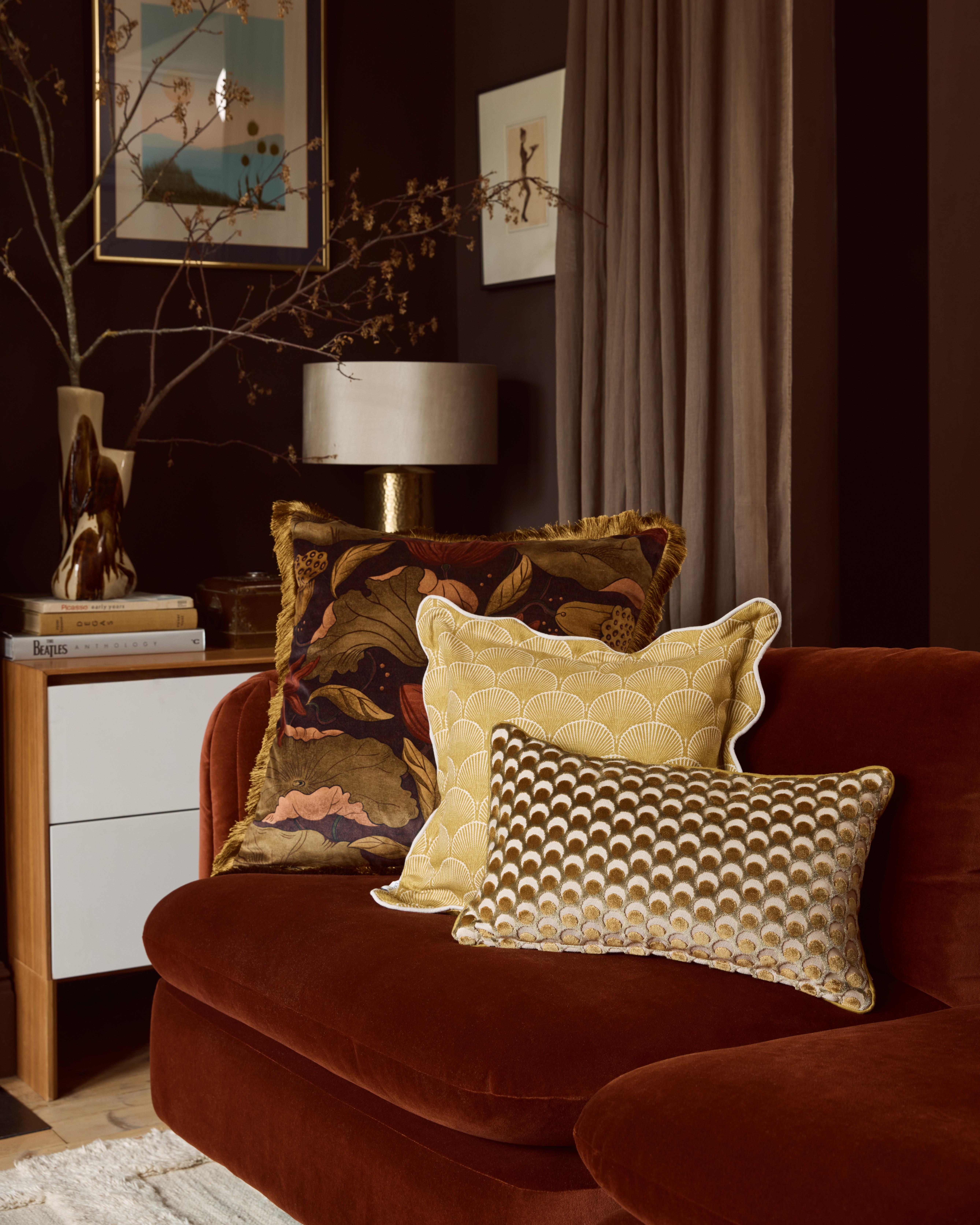
How to Make a Mood Board to Inspire Your Decor
Liberty’s Head of Design Interiors Genevieve Bennett swears by a great mood board to inspire and focus your vision. Here’s how to make your own
Read more
How to Make a Mood Board to Inspire Your Decor
Liberty’s Head of Design Interiors Genevieve Bennett swears by a great mood board to inspire and focus your vision. Here’s how to make your own
By: Charlotte OlbyBy definition, a mood board is a visual tool that layers colour and texture together to communicate concepts and ideas. But it's so much more than that. A good mood board will not only allow you to close down your many tabs (physically or mentally) and collate all your inspiration into one place, but it will help you to focus the particular mood, feeling and essence of your home. For those of you with the indecisive gene (myself included), torn between this colour or that fabric, a mood board is your way of making sense of it all in order to create a cohesive vision - be that for an entire reno project or simple updates for your living room.
Whether you’re a die-hard Pinterest fan or not, digital mood boards absolutely have their merits. The main benefit is, of course, that it's portable - either created via a handy phone app or on your desktop, a digital vision board can be updated and added to as often as the mood strikes. But while many designers today prefer the neat interface of a digital mood board, the Liberty design team still remains devoted to the cut-and-paste method. There’s something so very pleasing about an analogue board, filled with magazine tears, fabric swatches and paint colour charts pinned, pritt-sticked or blu tacked onto. Need any further convincing? Here is Liberty’s guide to make a mood board worth its weight in gold.
Your Canvas
A mood board, naturally, will require a board. Look for something sturdy like a classic cork noticeboard or even just some ultra-thick cardboard - you want something that can easily take pins or tack and will hold its own. Clear a space, have everything laid out in front of you with glue, scissors, fabric cuttings, photos and snippings.
Hunter Gatherer
Of course your mood board can be made up of an entire multitude of inspiration - there are no rules here. Now is the time to gather everything you’ve been pouring over and collate into one space, ready to hone your design. Look to both physical and digital sources with a mix of magazine tears, Pinterest saves, TikTok screenshots, fabric swatches, wallpaper samples and paint charts. Remember, you’ll want a good mix of imagery that shows both an entire scheme or room but also detail shots, product cut-outs that you’re keen to source and a good sense of your overall colour palette.
Find your Hero Piece
“When creating a mood board I find it helps to build it around a single item you really love, be that a favourite painting, wallpaper or fabric you feel strongly about,” advises Liberty’s Head of Design - Interiors Geneieve Bennett. “For example, if the focus is to be a beautifully painted wall or wallpaper, I always try and get hold of a large sample as this will be the focus of the room and so it needs to take up the most space on the mood board. Then you can start to get an idea of the proportions of the different elements and this will give a more realistic impression of the end result.”
The key is to start with the image, fabric or cutting that speaks to you the most. Perhaps it’s a Pinterest image that makes you think ‘I want to live there’ or something as simple as a swathe of velvet, decide on your anchor for the vision and get that placed initially onto your board.
Colour Theory
Used by interior designers and design-enthusiasts alike, colour theory is a great tool to apply and help you decipher your colour palette. While there are many schools of thought, there are three main colour families to choose from to help hone your style:
Monochromatic, aka colours all of the same hue but with varying saturation and brightness. This palette screams minimal and sophisticated, and is great to use alongside a strong focal point such as a statement wallpaper.
Analogous colours are colours that sit next to each other on the colour wheel. The closer they are in hue, the more they will blend together. It takes careful balancing to find the three that work happily together without clashing.
Complementary colours sit across from one another on the colour wheel. These colours make for a contrast while allowing each other to pop.
Deciding on your hero piece first will allow you to take colours from that inspiration and build a colour palette that works in harmony with your vision, whether you want to allow a bold print to sing or make it pop with complementary accent hues. Consider both the time of day when you’re using the room, if it's north-facing or south-facing and the overall feeling you want to invoke in the space.
Edit, Accent and Accessorise
Time to be decisive. Refine your choices by editing out images or cuttings that no longer speak to you, or do the same job (but not as well) as another image in the pile. It also pays to be realistic here, if you’ve fallen for an image of a high-ceiling, character property but are creating a scheme for your new build, it might be best to park that dream for the time-being. Don’t be afraid to let your mood board grow organically and play around with different options before committing to glue, let things sit for a while and move around the board.
Once you have committed to your hero piece and colour scheme, you can start to layer up your mood board with your accessory items like fabrics, furniture and finishings. Keep fiddling with your placement until you’re happy with how everything looks and feels, giving you a sense of how the scheme will come together in 3D and then start to stick everything down. A final tip? Take a picture of your moodboard so you have a physical and digital copy with you to always refer back to.


