In Conversation with: the Liberty Fabrics & Bridgerton Print Designers
From inspiration and challenges to the creative process, find out how Liberty’s print designers created the coveted fabrics collection
Read more
In Conversation with: the Liberty Fabrics & Bridgerton Print Designers
From inspiration and challenges to the creative process, find out how Liberty’s print designers created the coveted fabrics collection
By: Team Liberty
For readers who, like us at Liberty HQ. have not-so-patiently been waiting for the second part of Netflix and Shondaland's Bridgerton to launch on Netflix, we have a treat in store. Whether you have already raced through the second drop in its entirety (if so, we're impressed) or are whiling away the hours before you can sit down and watch at your leisure: immerse yourself in the romance and Regency to the 'Ton with our exclusive insight behind the scenes of the Liberty Fabrics & Bridgerton collection: in conversation with the print designers behind its creation.
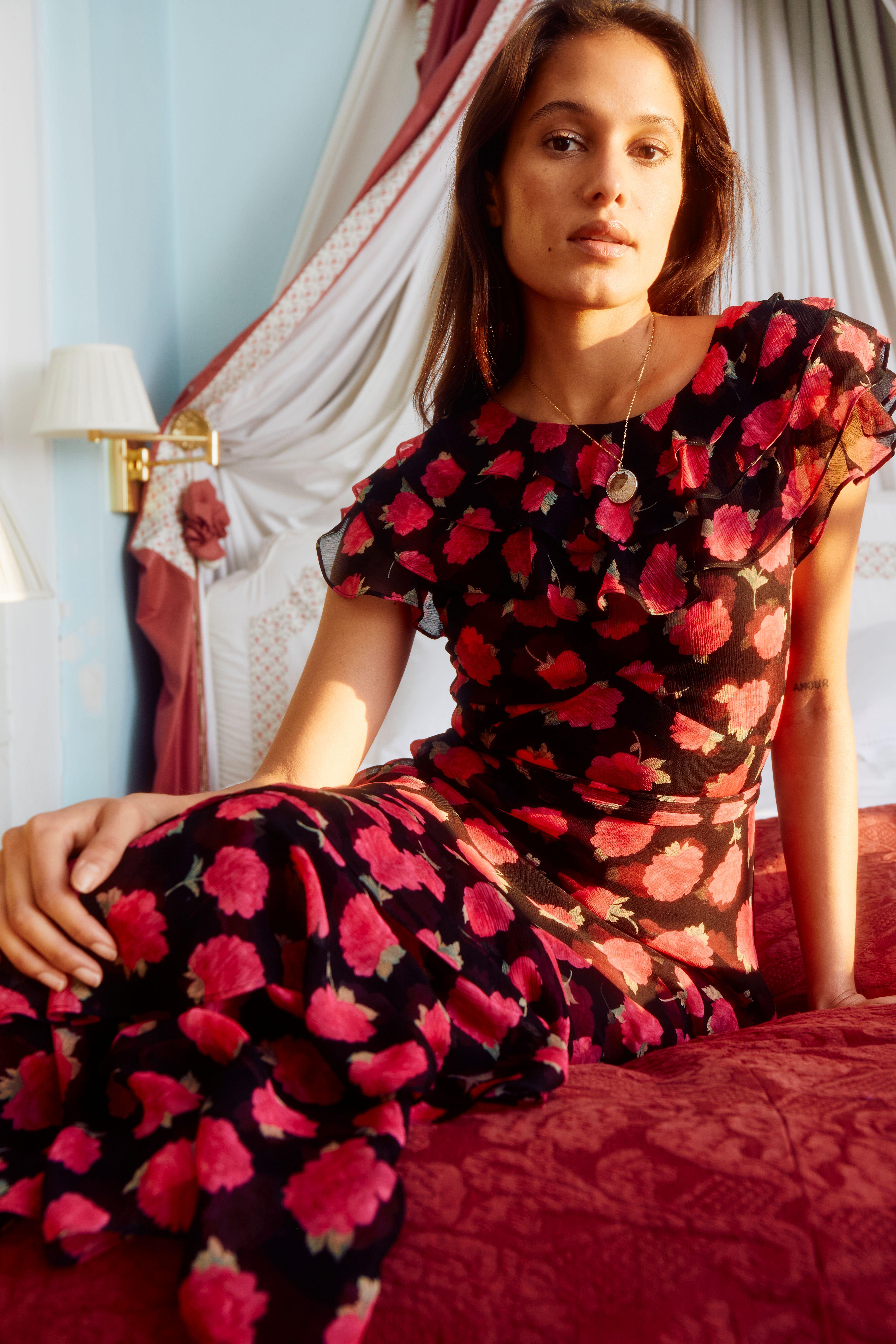
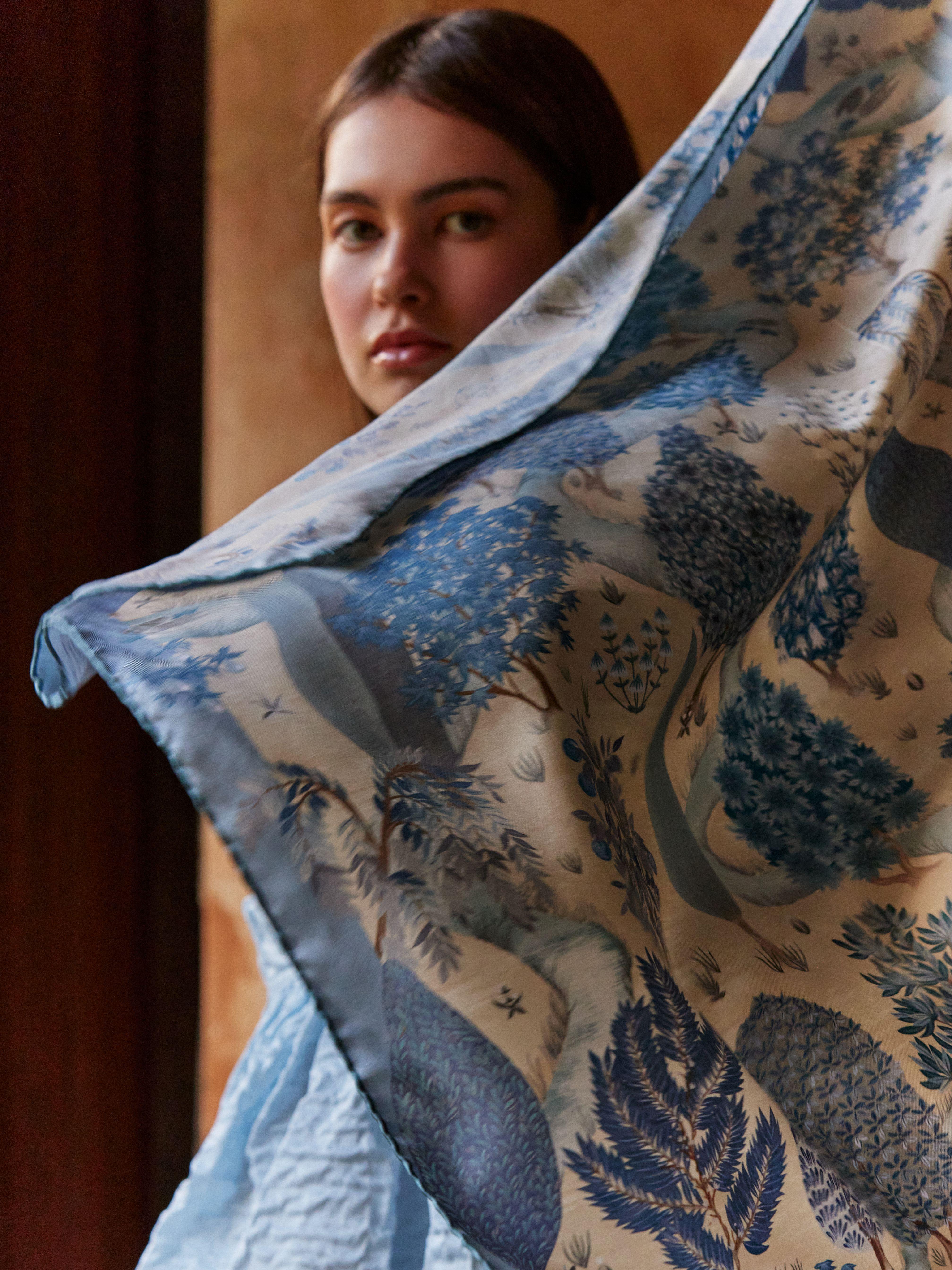
Features nine distinct designs, thoughtfully divided into three atmospheric chapters, Penelope's Garden, Regency Bouquet and Botanical Trellis, this truly is the collection of the season, meticulously designed and hand-painted by the talented artists in the Liberty Design Team.
We sat down with Liberty’s Design Director, Mary-Ann Dunkley and Designer Helen Loft to find out how she and her team carried out this elusive project from start to finish, the inspiration behind each chapter, their favourite prints and the challenges they faced throughout the process
Can you walk us through your process from when designing the Bridgerton collection?
Mary-Ann: We always start working by looking in our archive and for Bridgerton we looked closely into designs from the Regency era and designs from the pattern books we have from the early 1800s, these include richly woven fabrics, detailed ribbons and beautiful coloured silks.
We worked closely with the team at Shondaland & Netflix at this early stage so the collection developed in with an excited collaborative energy. The Liberty archivists and designers presented ideas that had the spirit of the historical period and artworks that would celebrate the aesthetic of the new season of Bridgerton style.
Helen: We did a lot of research into the pattern and colours of Bridgerton- looking at recurring design details from past seasons as well as being introduced to motifs, palettes etc. that were going to be important in the new storyline.
We were particularly inspired by the wallpapers, floral displays & vases, and beautiful architecture details within the sets, and we tried to bring these decorative details and historical references into the print selection.
MA: Once we’d made an initial selection the design team started working on the different design directions. This involved drawing and painting and re-working the archive pieces so that they had a contemporary sensibility. Some elements get taken out, shading is added and the layout of the repeat is considered so it will work with contemporary pattern styles and experimentation of scales begins to ensure the fabrics offer the customer delicate detail next to impactful scale.
What techniques or materials did you use for this collection, and why?
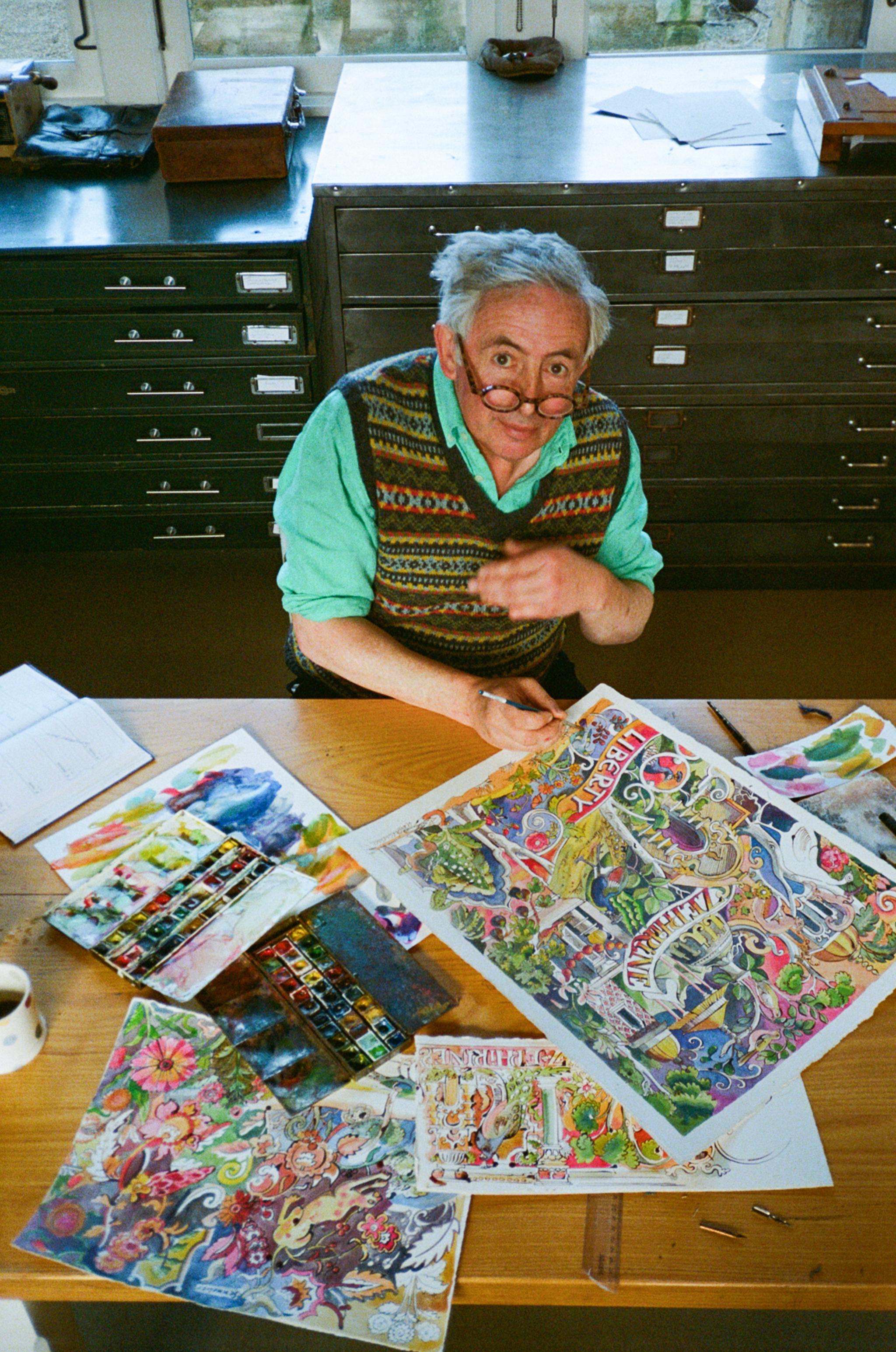
Helen: For the artworks the designs were painted using gouache paint which allowed us to create beautiful flat colour which replicates perfectly when translated into printed fabrics, but it still allows us to control the shading and tone.
It felt appropriate to hand paint the designs, so they hand an artisanal feel appropriate to the era we were inspired by.
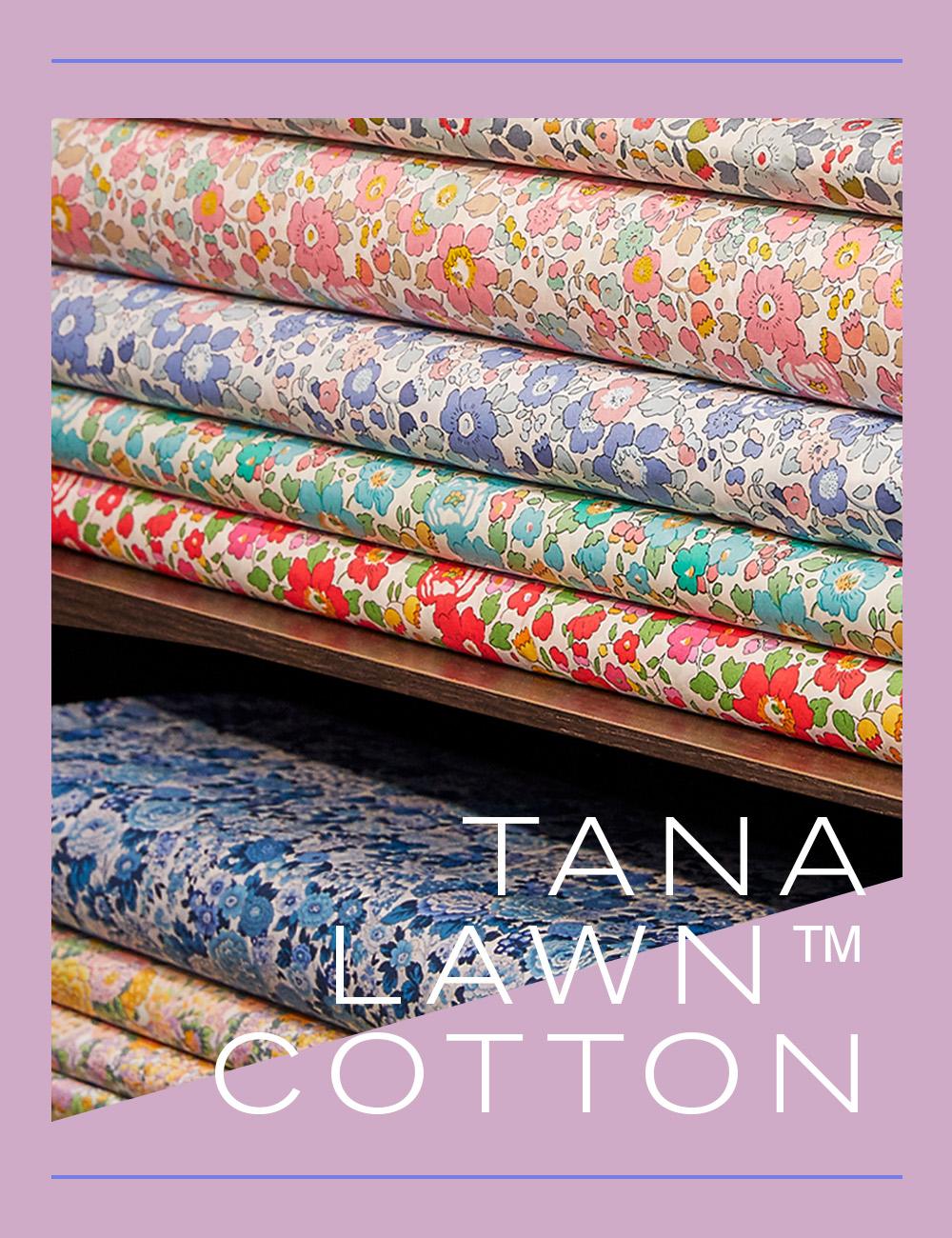
MA: The team of experts in the Liberty Print mill in Italy advise on techniques. Designs were printed on our favourite Tana Lawn™ cotton, silk crepe de chine which has richness but with a matt finish, silk twill which offers a more structured fabric and Belgravia silk satin which has a elegant shine transforming colour on fabric like a Bridgerton customer may be looking for.
How did you choose which archival prints to use for this collection?
Helen: We had a lot of in person, creative conversations with Netflix & Shondaland and explored different ways to interpret the design styles.
It was a collaborative process where the beautiful designs met with their creative visions. It was important to learn about the characters and storyline in the new season and to draw this into the prints and colours.
Colour for each character was important, for example Penelope’s new more sophisticated palette including deep teal and richer pigments were included as they were really symbolic in her character’s transformation.
How would you sum up this collection in three words?
MA:
Stately
Romantic
Flamboyant
Helen:
Exuberant
Captivating
Opulent
How did you combine the Bridgerton look with the Liberty aesthetic and stay true to both?
MA: It was exciting to celebrate the spirit of the textiles in the series, it has such wonderful colour and the challenge was really how to make an edit for today’s customer, how to take the colours from the screen to textiles for today’s taste.
When designing the different chapters within the collection, how did you ensure they differed? Were there specific artistic elements, symbols or characteristics you used in one chapter but not the other?
Helen:
Three different Chapters in our collection; Penelope’s Garden, Regency Bouquet & Botanical Trellis.
Penelope’s Garden pays homage to all the wonderful garden settings that feature so much in Bridgerton.
Regency Bouquet was inspired by the parties and formal soirees- prints that were inspired by more formal floral displays and interiors.
Botanical Trellis has a more delicate feel and features charming smaller scale florals alluding to the romance in the stories.
The chapters played an important storytelling role for our collection. They allowed us to focus on important environments and settings that would be recognizable to viewers. We wanted the prints to make you feel like you had stepped into the Bridgerton world.
Do you have a favourite chapter or print from the collection and if so, what do you enjoy most about it from a design point of view?
Helen: My favourite chapter from the collection is Botanical Trellis. The prints are quite understated but still feel beautifully detailed and exquisite. The chapter has a real lightness and delicacy to it. Even though these are quieter prints they still hold their own amongst the more extravagant bouquets. They also have a real wearability so have so much scope for customers.
MA: I love Regency Trail, it celebrates the romance, beautiful gardens trailing elegantly across the fabric. It could be worn in so many ways, as a dramatic dress or relaxed with denim so perfect for today’s customer.
Were there any prints that were challenging to create? And if so which ones and why?
Helen: There are a couple of prints that feature about 20 colours and these were more challenging to work on. We want each colourway to have a different feel had to be conscious of this and work hard to ensure they offer something different across the collection.
The design Ribbon Cascade features a scrolling ribbon and stripes in the background and this was interesting to interpret. We wanted the print to stay appropriate to the historical period but also be relevant to the customer. We worked on making sure the motifs and florals balanced well and that the print still had a flow when worn across the body.




?fmt=auto&qlt=default)





?fmt=auto&qlt=default)
